How to build a histogram in Excel from table data
 Charts are a great tool to visualize data from different sources. Not many people know how to build a histogram in Excel from table data. In fact, there is nothing complicated here. Let's look at the various options.
Section "Diagrams"
So, let's get down to business.
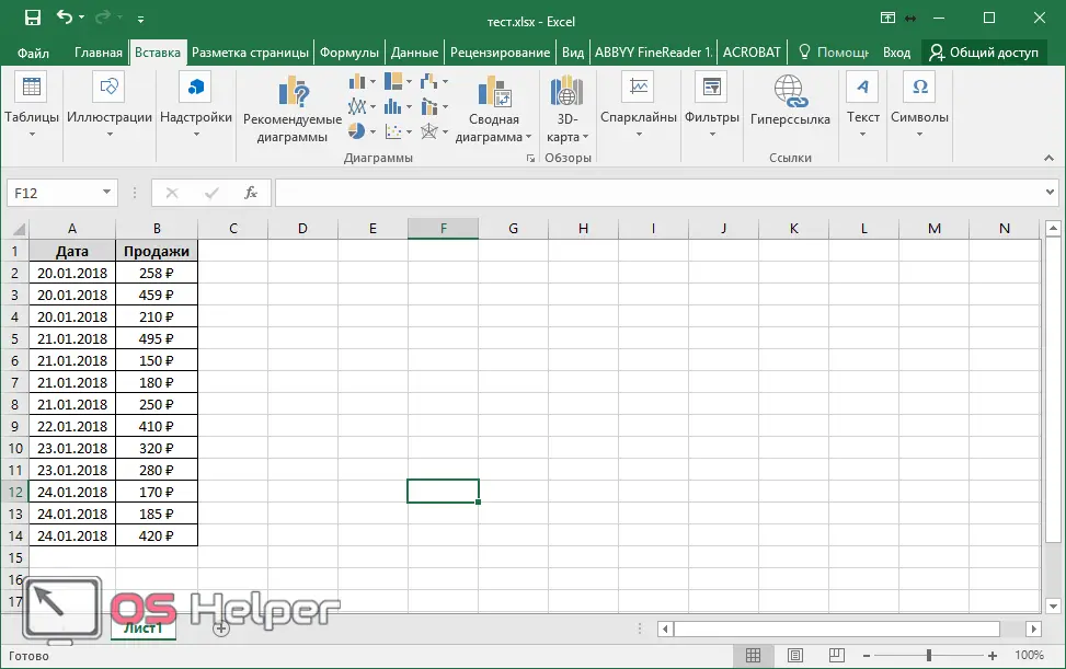
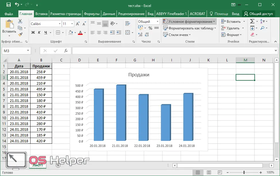
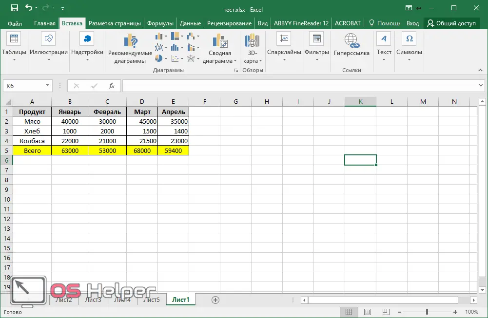
- First you need to create a table. The values can be arbitrary.
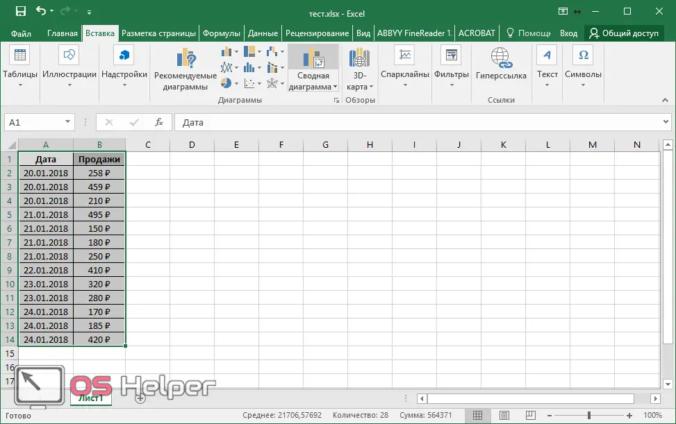
- The next step is to extract the data.
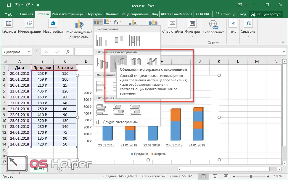
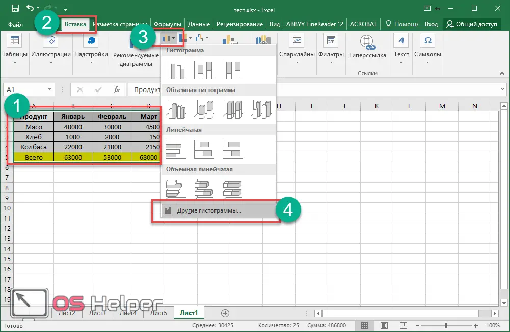
- Open the menu-tab "Insert" and click on the icon for working with the histogram.
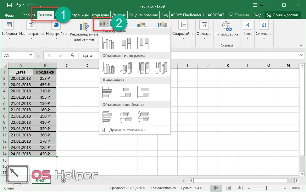
You will be offered to build in various most popular ways:
- regular histogram;
- bulk;
- ruled;
- volumetric line.
You can hover over each of them and see examples. To view other options, you need to click on the corresponding item.
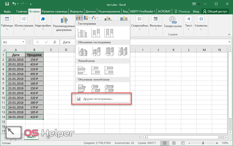
Please note that there are several types of construction in each category.
- When hovering over each item, in addition to the preview, brief information about the purpose will also be displayed so that the user can make the right choice.
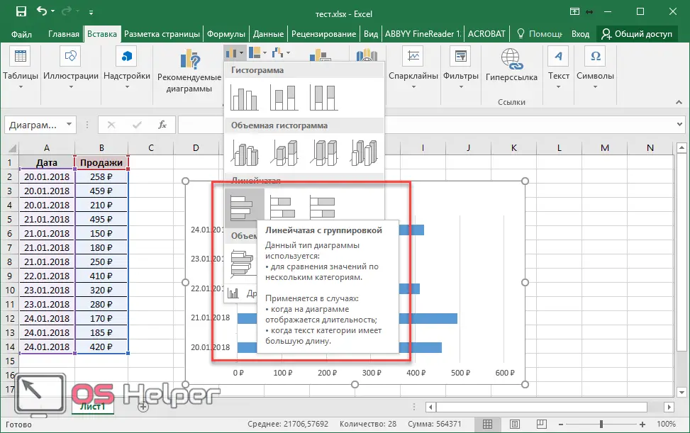
- If you select "volumetric histogram with grouping", you can get the following result.
Stacked bar charts
This time we will have to add another column. Since the two columns will look exactly the same as in the case of grouping.
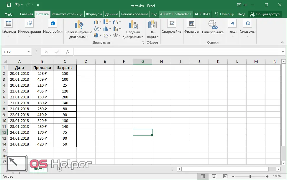
The third column must be in the form of numbers, not text, so that the program can add the data normally.
- Select the table, click on the "Histograms" button and select something with accumulation.
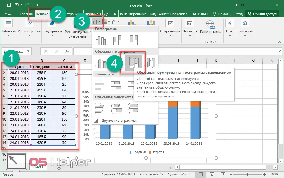
- As a result of this, you will see the following.

As you can see, in this histogram, the scale along the y-axis is displayed as a percentage. This method of construction is good because you can see comparative information.
- The statistics for each day will show how sales and costs relate to each other (in the case of an example). If you are not comfortable working with percentages, and want the data to be presented in absolute terms, then in this case you need to choose a different type of histogram.
Also Read: How To Turn Off Compatibility Mode In Excel
Data analysis package
This feature is not available by default. In order to insert it on the panel, you must do the following steps.
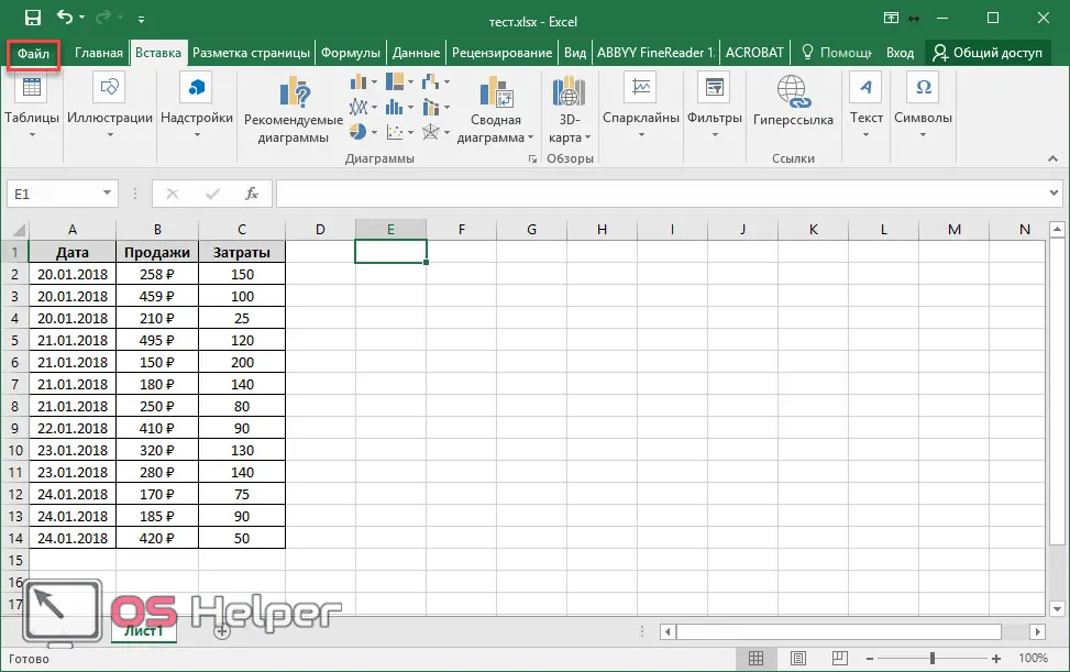
- Click on the "File" menu item.
- Click on "Settings".
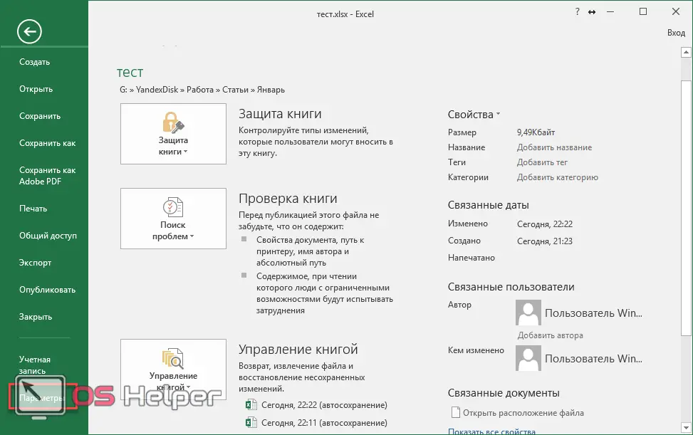
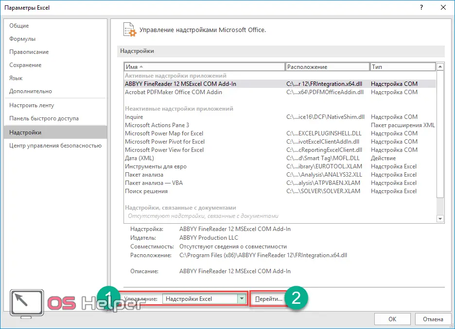
- Next, go to "Add-ons".
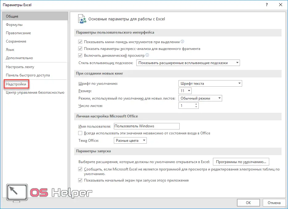
- Make sure Excel Add-ins is selected in Manage. After that, click on the "Go to ..." button.
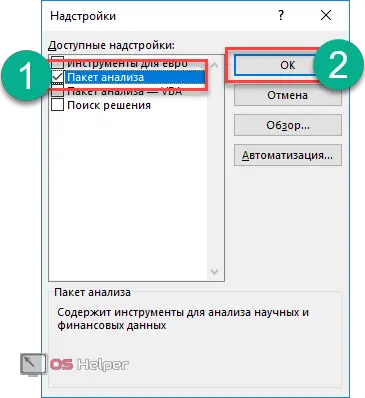
- Check the box next to "Analysis Package" and click on the "OK" button.
- Go to the main panel on the "Data" tab. A new Data Analysis button will appear on the right side of the ribbon.
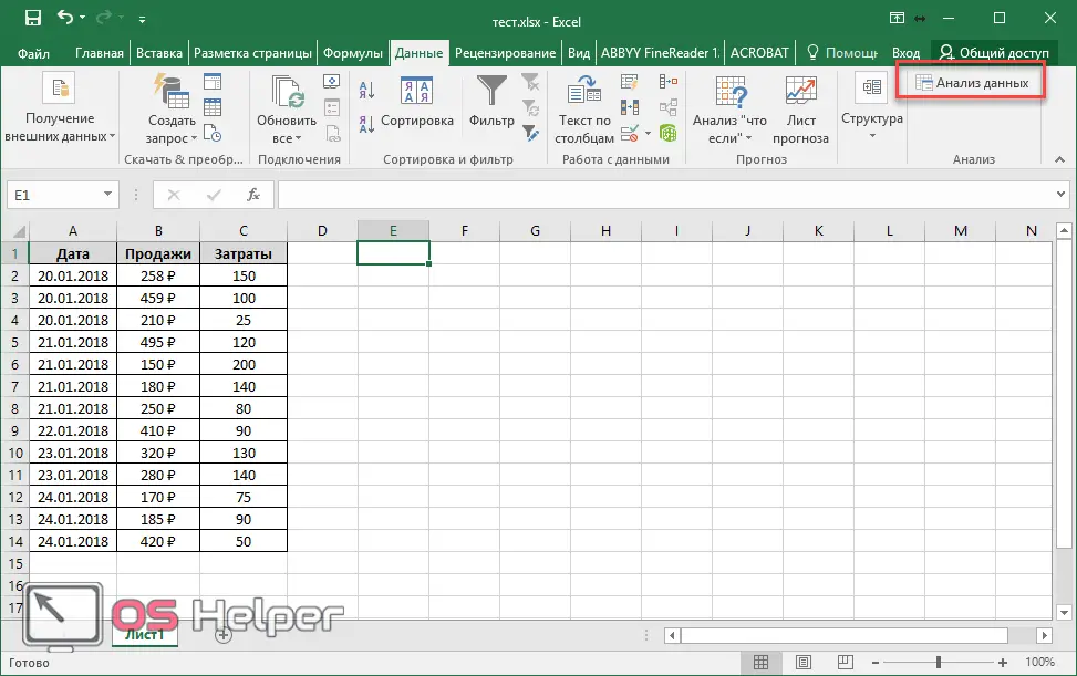
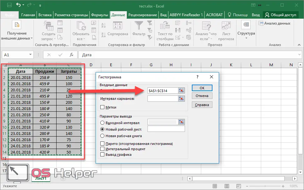
Now let's look at the process of creating a chart for this table. To do this, you must perform the following steps.
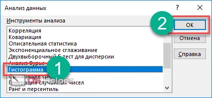
- Click on the button you just added. Select "Histogram" and click on "OK".
- After that, you will see the following window.
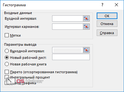
- In order to specify the "Input interval", simply select the table. The data will be filled in automatically.
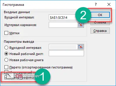
- Now check the box next to "Graph output" and click on the "OK" button.
- As a result of this, you will get such a "Histogram" with the analysis of values.
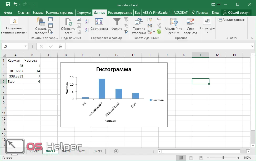
In this case, the x and y axes are selected automatically.
Conditional Formatting
A beautiful analysis of the entered data can be done right inside the table.
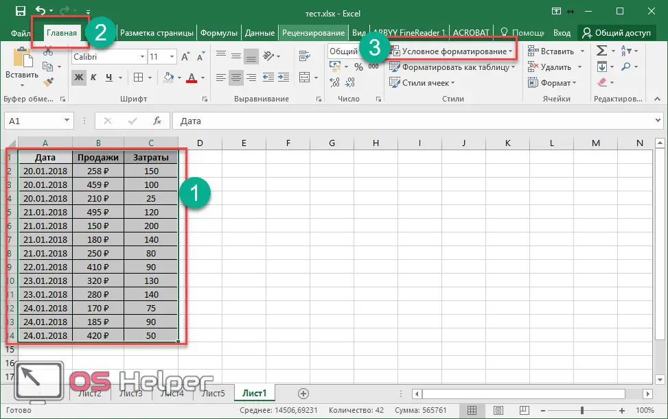
- To do this, select it, go to the "Home" tab and click on "Conditional Formatting".
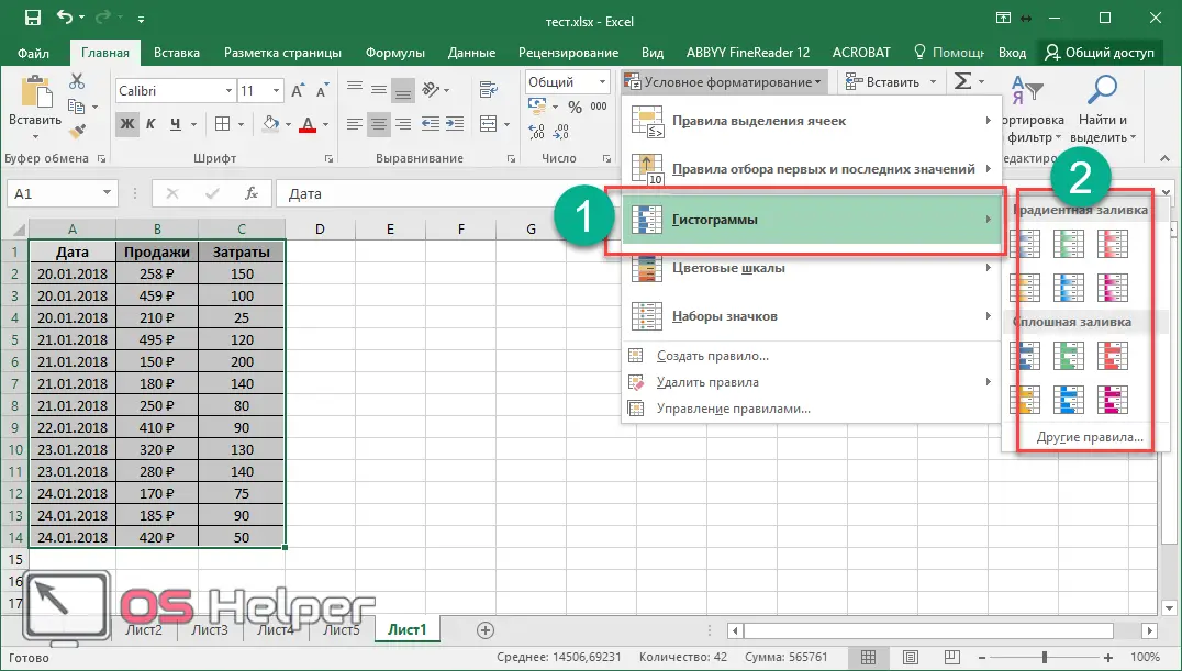
- Select "Histograms" from the menu that appears. After that, a large list of different options will appear. You can try to overlay any colors you like. To do this, just hover over one of the proposed templates.
- As a result, get a beautiful table in which the data is represented by a gradient fill.
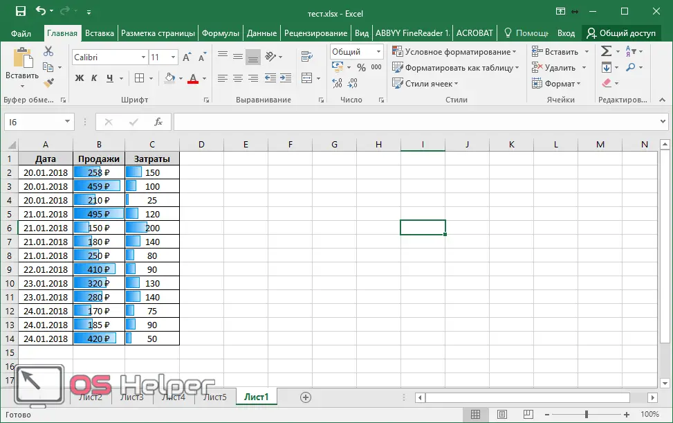
In relative units (shading), it is much easier to analyze information and thereby determine which cell has the maximum or minimum value.
Additional distribution ranks
There are other types of statistical data processing. These include:
- Pareto;
- Frequency polygon;
- Cumulates, etc.
See also: Subtotals in Excel
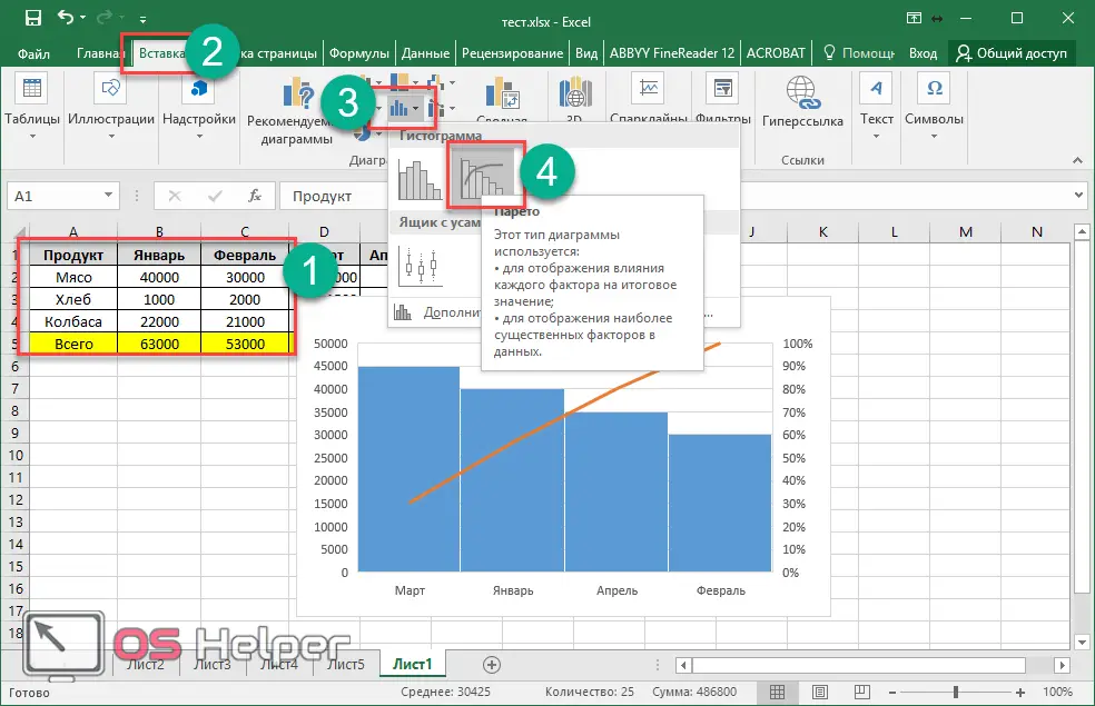
Most of them can be created with ready-made templates. For example, to create a "Pareto Chart" you need to do the following.
- Select table.
- Go to the "Insert" tab.
- Click on the "Insert Statistical Chart" icon.
- Select the desired workpiece.
How to draw a histogram
As a rule, most users do not like the standard appearance of the created objects. It's very easy to change it.
- When you select a chart, a new Design tab appears in the menu.
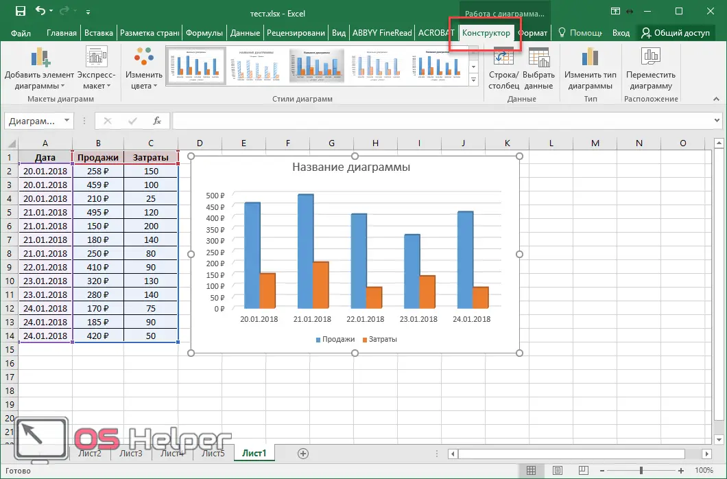
Thanks to her, you can do anything. In addition, editing is possible through the context menu.
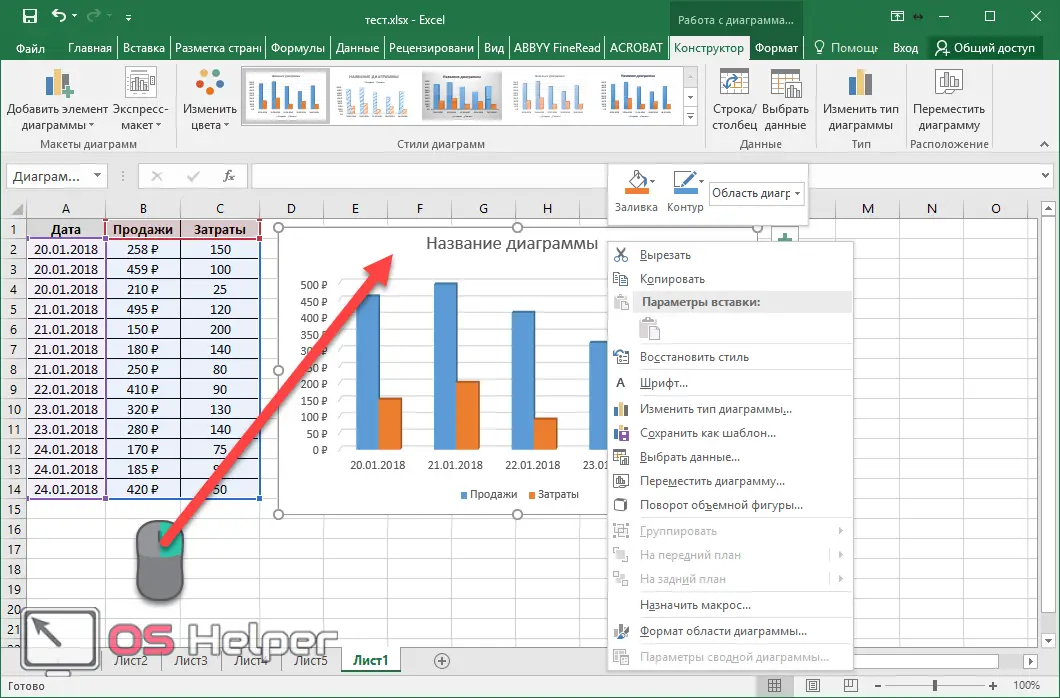
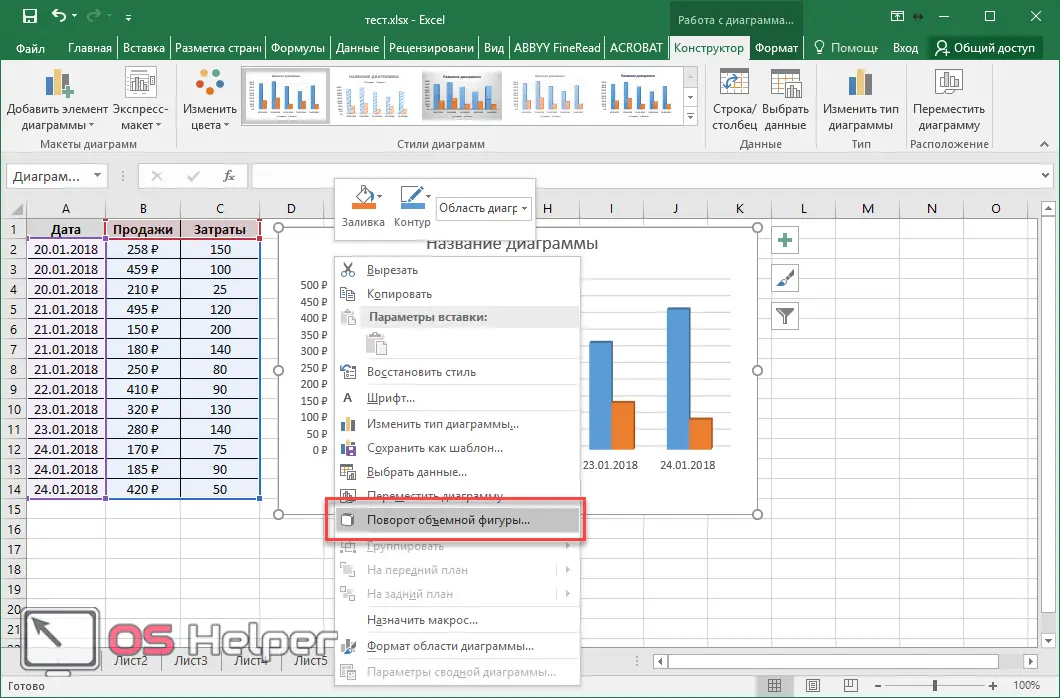
By right-clicking on an empty area of the diagram, you can:
- copy or cut;
- change type;
- select other data;
- move it;
- rotate the volumetric figure.
Let's consider some options.
copying
By clicking on the corresponding menu item, the entire contents of the histogram will be in the clipboard. After that, you can paste it into Word. It is worth noting that you can do the same using the keyboard shortcut [knopka]Ctrl[/knopka]+[knopka]C[/knopka]. To paste, use the combination [knopka]Ctrl[/knopka]+[knopka]V[/knopka].
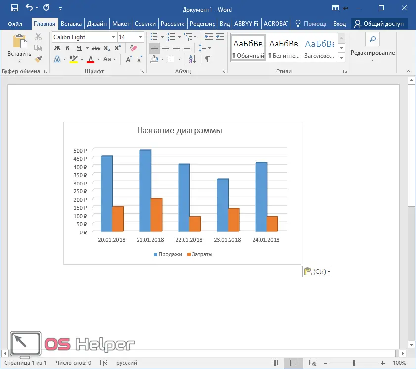
Looks very nice.
moving
To get started, click on "Move Chart" in the context menu.
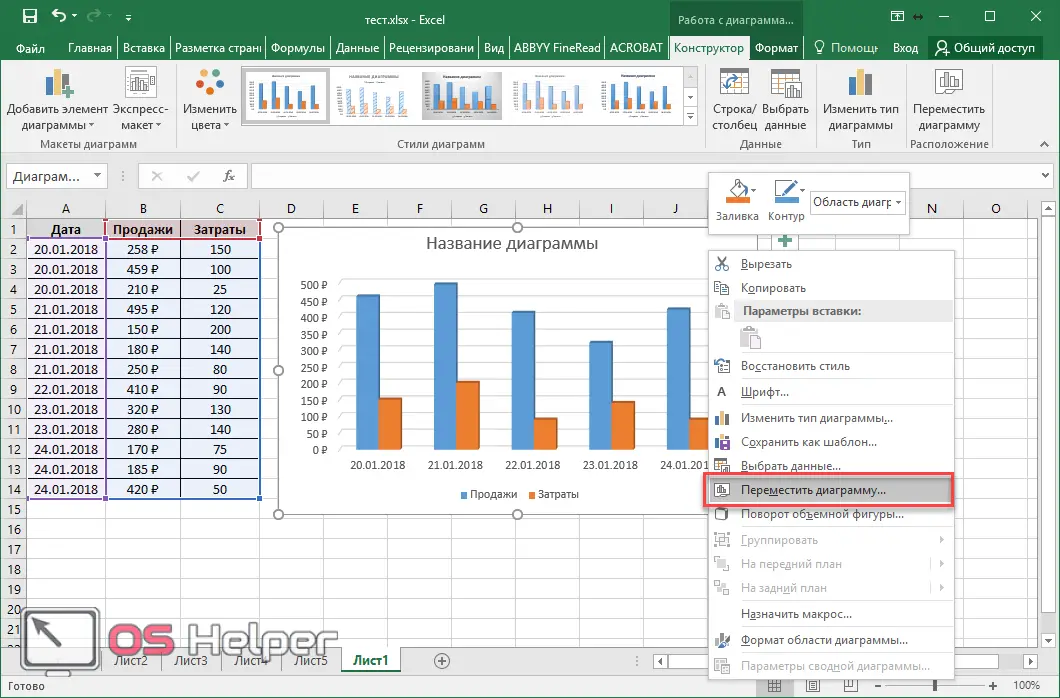
After that, a window will appear in which you can specify the purpose of the selected object.
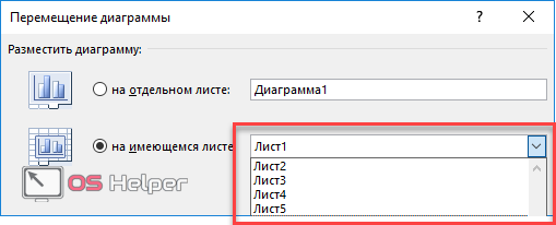
If you choose the first option, it will be moved to a new sheet.
Rotation
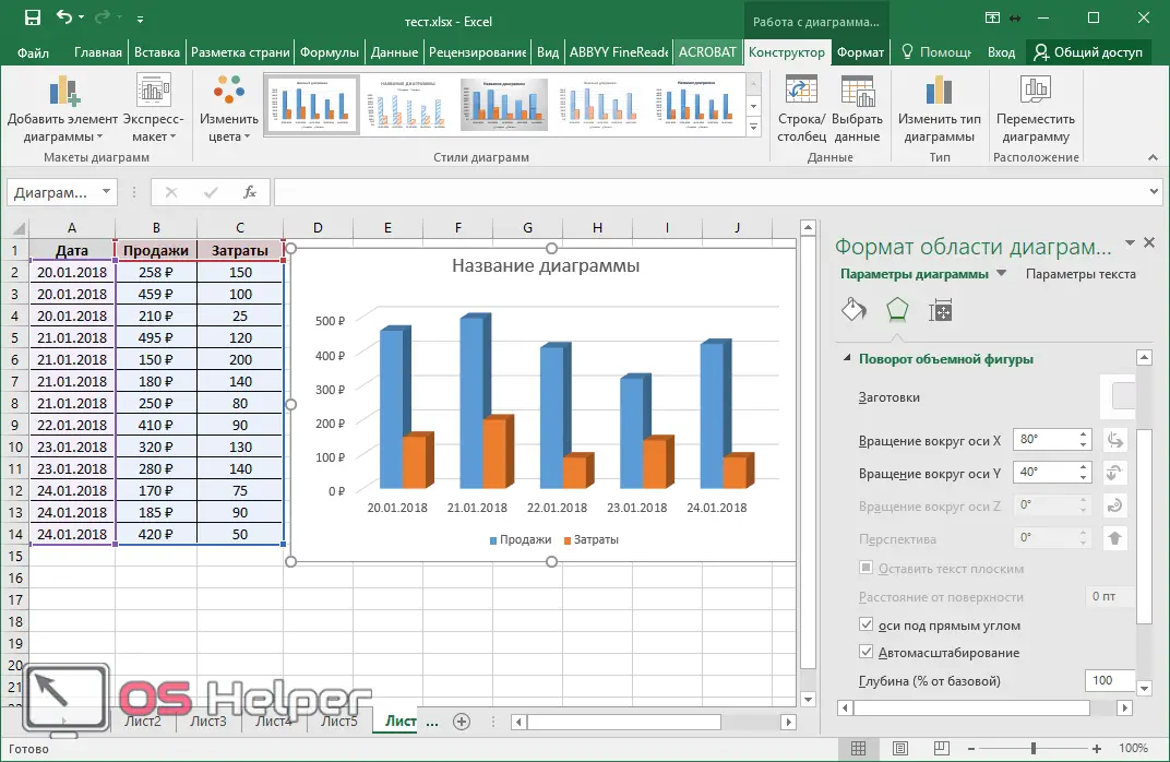
For these manipulations, you need to select the following item.
As a result, an additional panel will appear on the right side of the screen, in which you can “play around” with two axes.
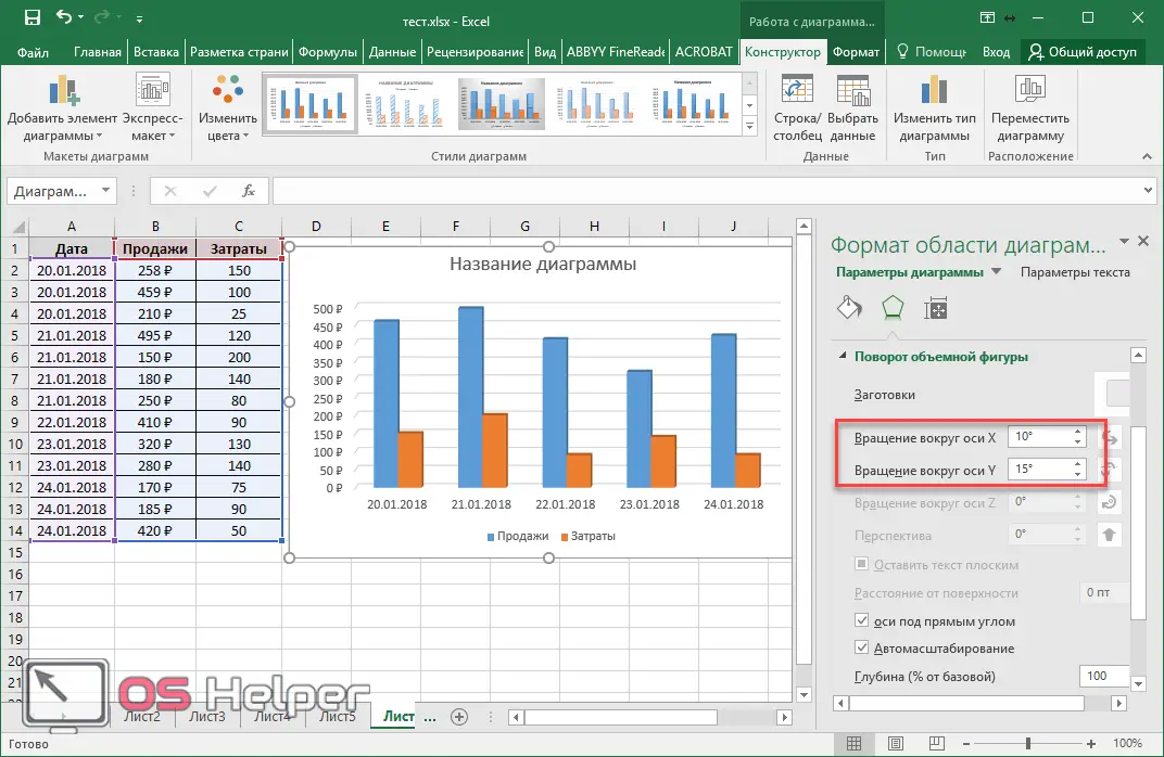
In this way, you can give even more volumetric effect.
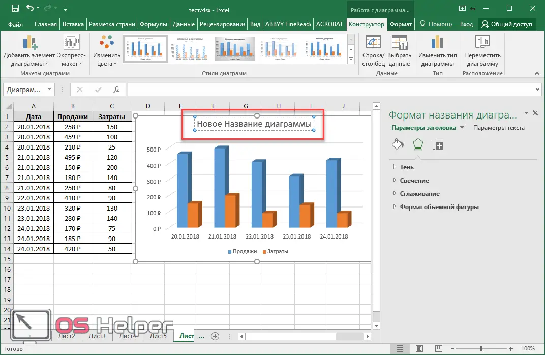
We sign the object
If you click on the name, a panel for working with text will be displayed on the right. Moreover, it will be possible to edit.
Optionally, you can add effects such as:
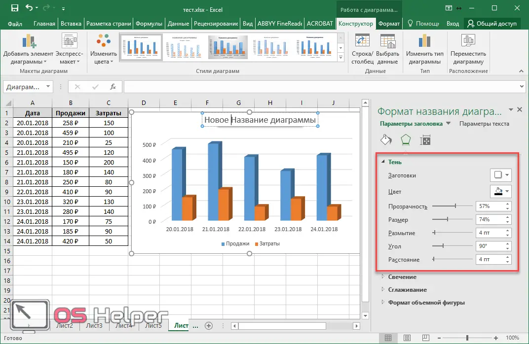
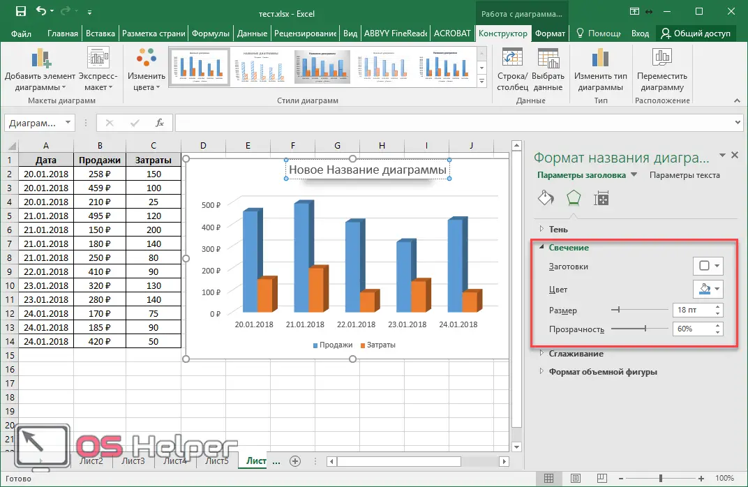
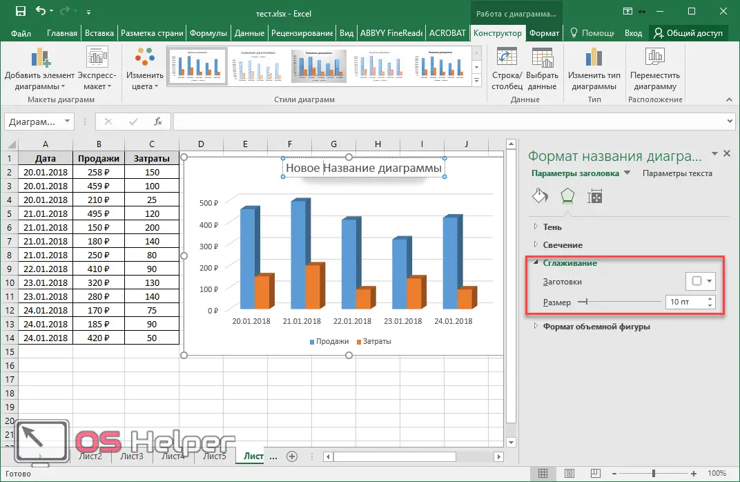
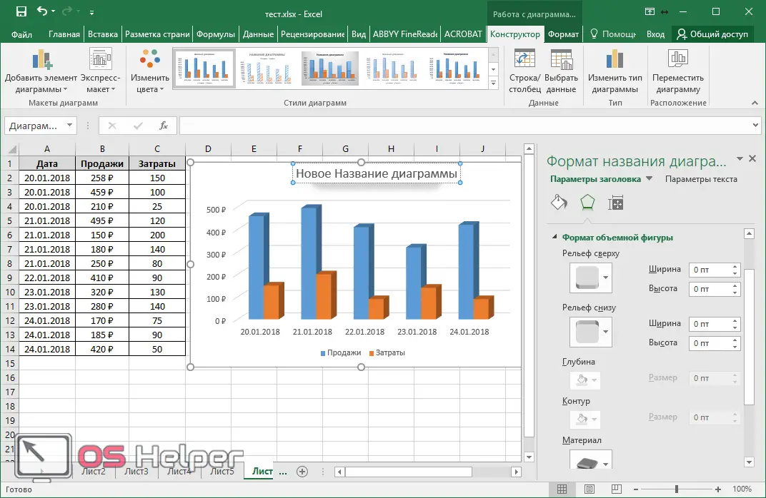
You can combine all of these individual attributes. But do not overdo it, otherwise it will turn out to be a nightmare.
How to combine a bar chart and a graph in excel
To combine different types of objects, it is necessary to use non-standard sets of diagrams.
- For this example, let's create another table with more data.
See also: Error in Excel when sending a command to the application: we solve the problem
- Now select all the rows, go to the "Insert" tab, click on the "Histograms" icon and select the last option.
- In the window that appears, go to "Combined".
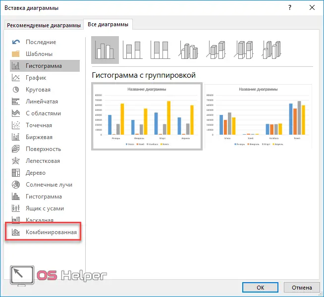
- You will then be able to specify the chart type for each series.
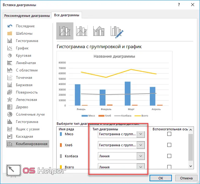
- It is necessary to specify "Histogram with grouping" everywhere, and for the "Total" series - the type "Line". In this case, you need to put a tick in the column "Auxiliary axis".
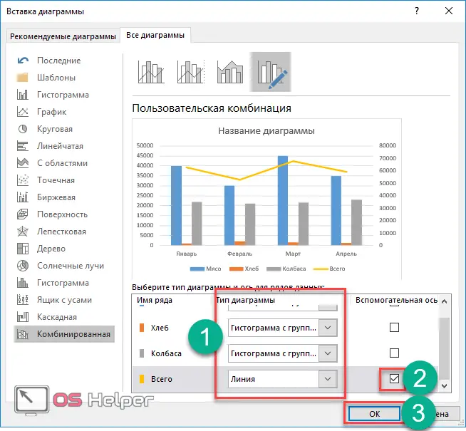
- After clicking on the "OK" button, we will get a new chart that combines a histogram and a graph.
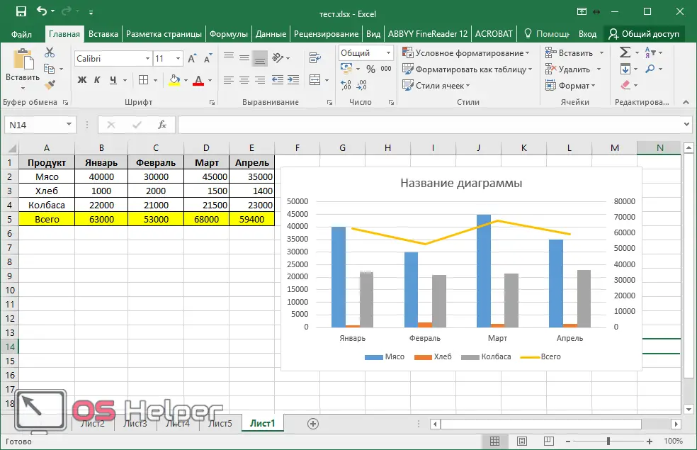
Please note that an additional scale has appeared on the right along the Y axis, intended only for the line, that is, for the “Total” row. The left scale is for everything else.
Chart online
For those who cannot build a histogram correctly, online services come to the rescue. For example, the site OnlineCharts.
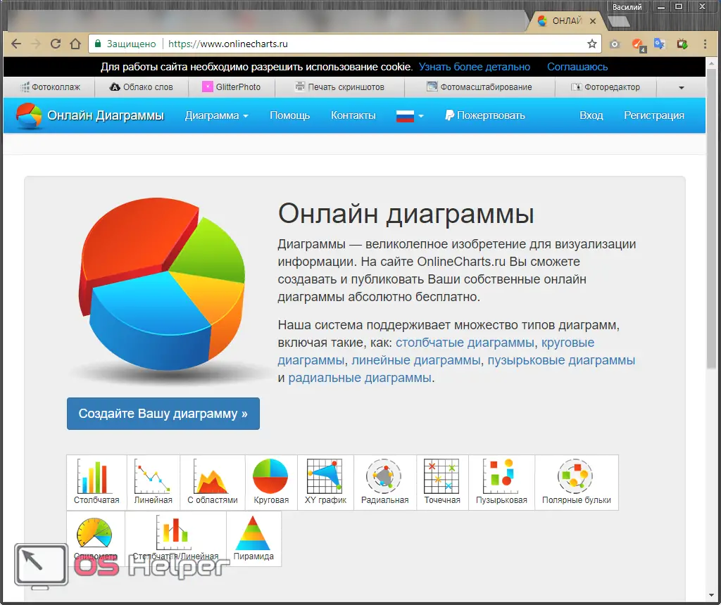
By clicking on the "Create Your Diagram" button, you will see a huge number of different settings, thanks to which you can draw whatever you want.
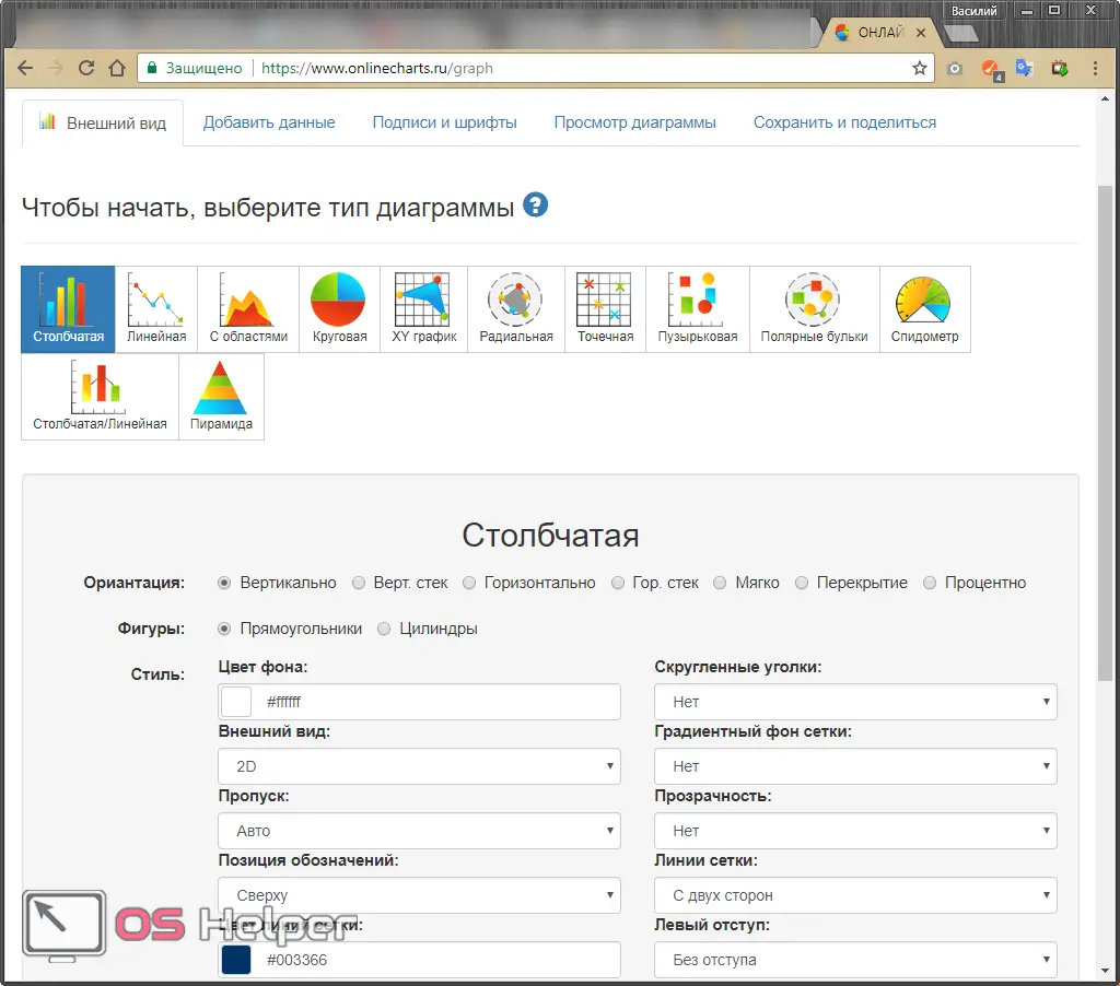
The result is easy to download to your computer.
Conclusion
In this article, we took a step-by-step look at how to create different types of charts using various tools. Don't be afraid to experiment. You can always delete your result.
It should be noted that there are different versions of Excel. For example, Excel 2010, 2013 and 2022 are very similar in this regard. The products of 2003 and 2007 are not so relevant nowadays and the difference between them is colossal.
Video instruction
For those who still have some questions, it is recommended to watch the video, in which everything is explained in detail with additional comments.