How to build a graph in Excel according to the table
 A large amount of information is usually easiest to analyze using charts. Especially when it comes to a report or presentation. But not everyone knows how to build a graph in Excel according to the table data. In this article, we will look at various methods on how to do this.
How to build a simple graph
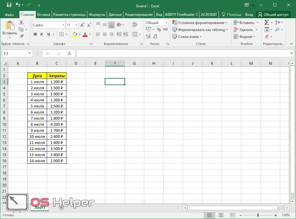
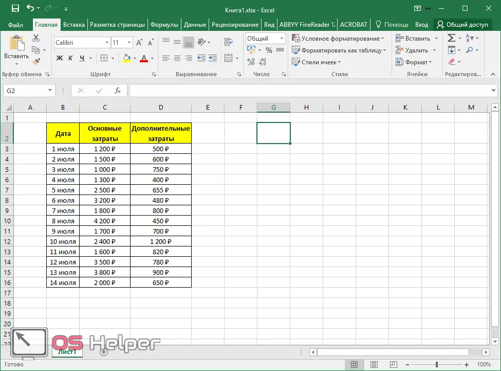
First you need to create some kind of table. For example, we will investigate the dependence of costs on different vacation days.
Next, you need to perform the following steps.
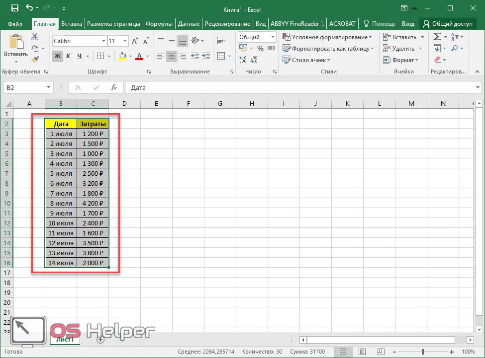
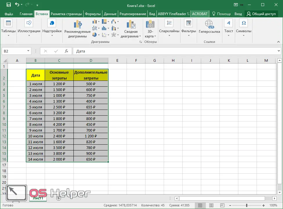
- Select the entire table (including the header).
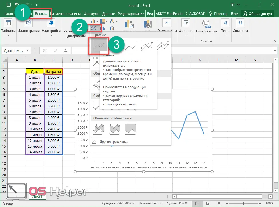
- Go to the "Insert" tab. Click on the "Charts" icon in the "Charts" section. Select the line type.
- As a result, a simple graph will appear on the sheet.
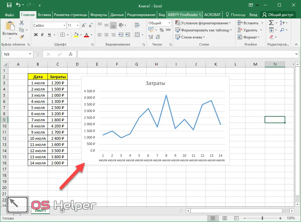
Thanks to this graph, we can see which days had the highest costs, and when, on the contrary, the lowest. In addition, on the Y-axis we see specific numbers. The range is set automatically, depending on the data in the table.
How to plot multiple data series
Making a big chart with two or more columns is easy. The principle is almost the same.
- To do this, let's add another column to our table.
- Then we select all the information, including the headings.
- Go to the "Insert" tab. Click on the "Charts" button and select the linear view.
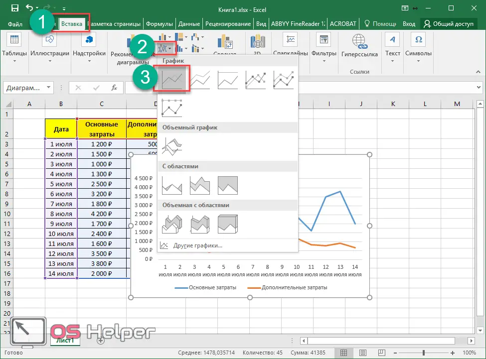
- The result will be the following chart.
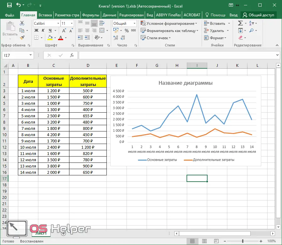
In this case, the table header will be the default value - "Chart Title", since Excel does not know which of the columns is the main one. All this can be changed, but this will be discussed a little later.
How to add a line to an existing chart
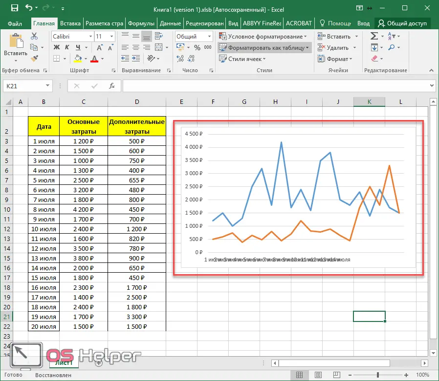
Sometimes there are times when you need to add a row rather than build something from scratch. That is, we already have a ready-made chart for the “Main Costs” column and suddenly we wanted to analyze additional costs as well.
Here you might think that it is easier to build everything anew. On the one hand, yes. But on the other hand, imagine that on your sheet you have not what is shown above, but something on a larger scale. In such cases, it will be faster to add a new row than to start over.
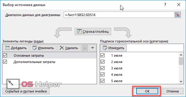
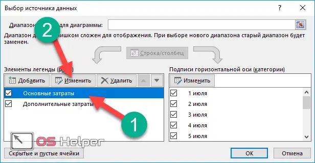
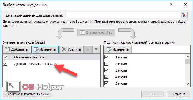
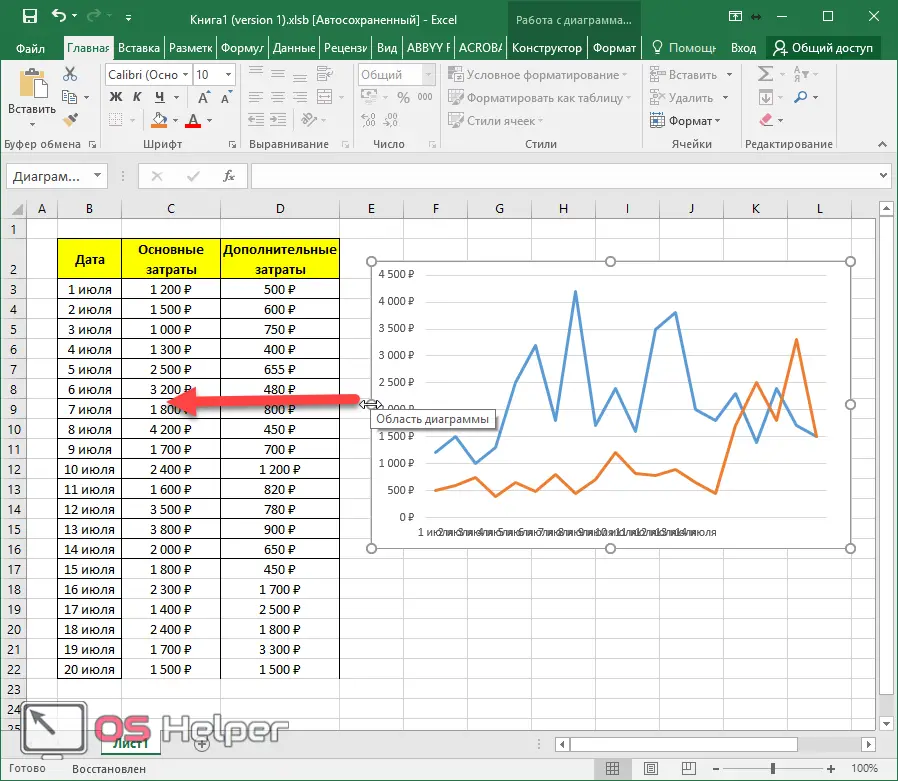
- Make a right mouse click on an empty area of the diagram. In the context menu that appears, select the "Select Data" item.
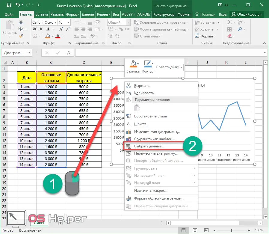
Please note that those columns that are used to plot the graph are highlighted in blue in the table.
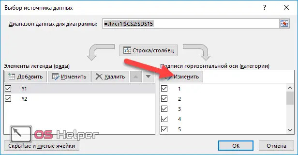
- After that, you will see the "Select Data Source" window. We are interested in the "Data Range for Chart" field.
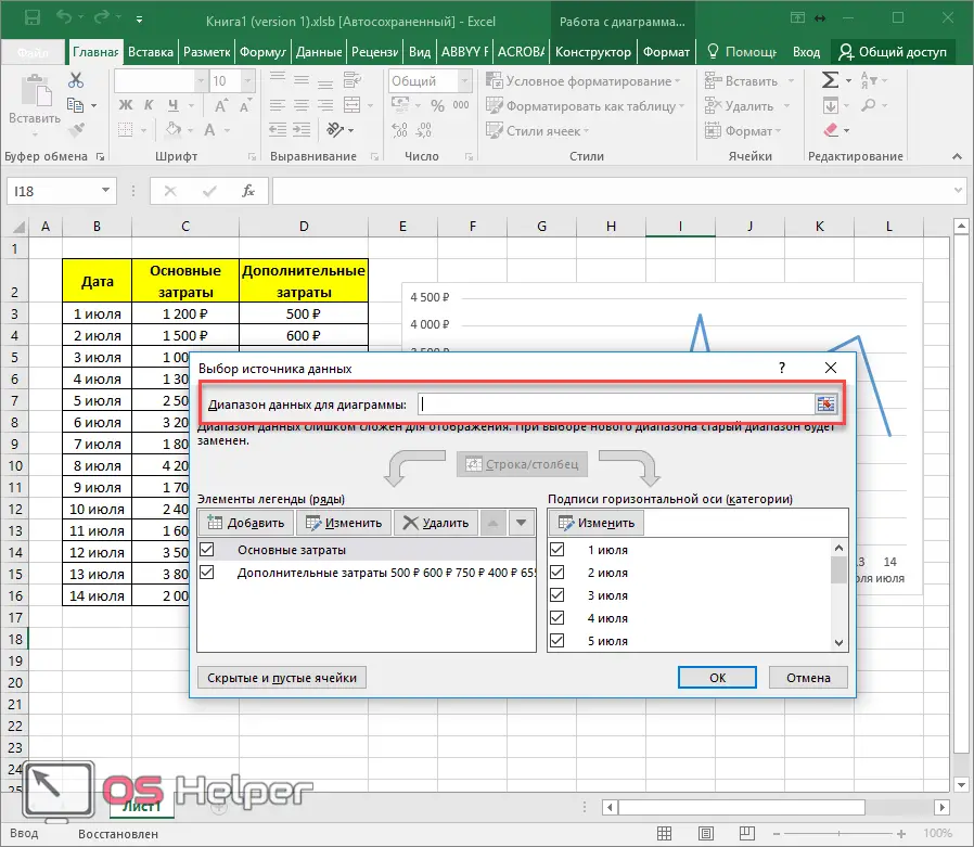
- Click once in this input field. Then select the entire table in the usual way.
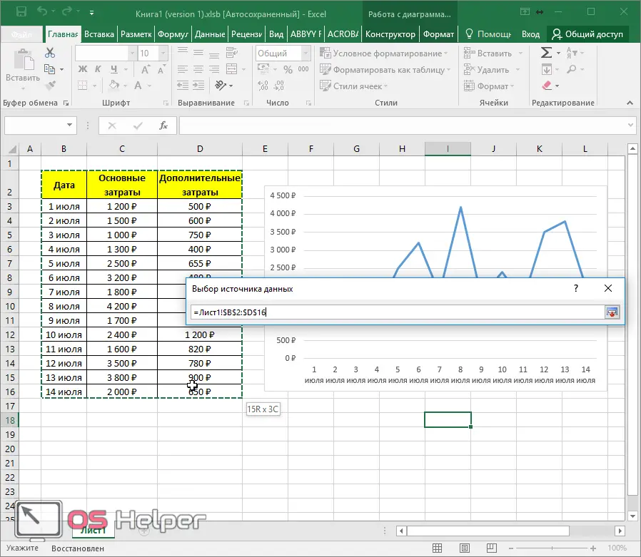
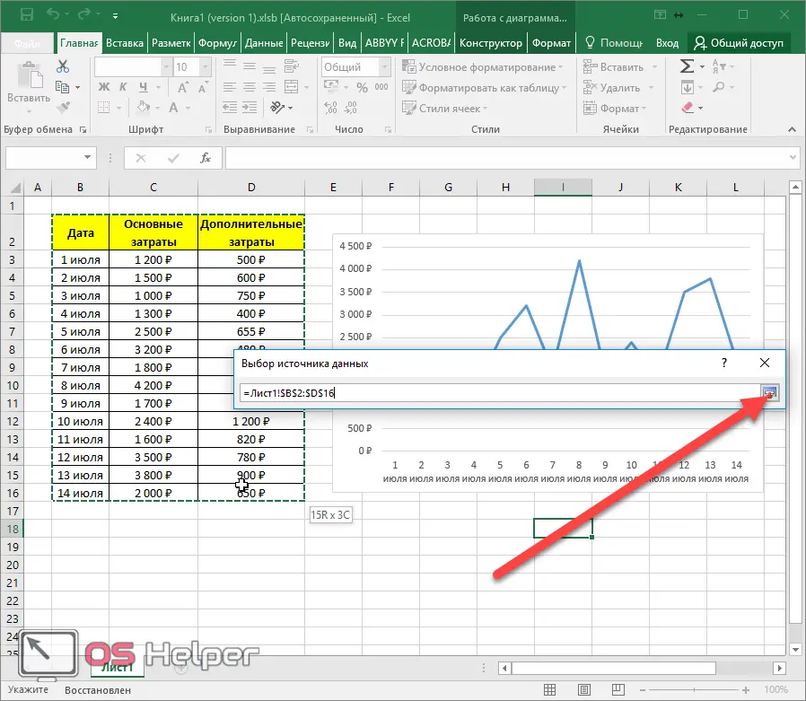
- As soon as you release your finger, the data will be inserted automatically. If it doesn't, just click on this button.
See also: Subtotals in Excel
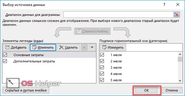
- Then click on the "OK" button.
- As a result, a new line will appear.
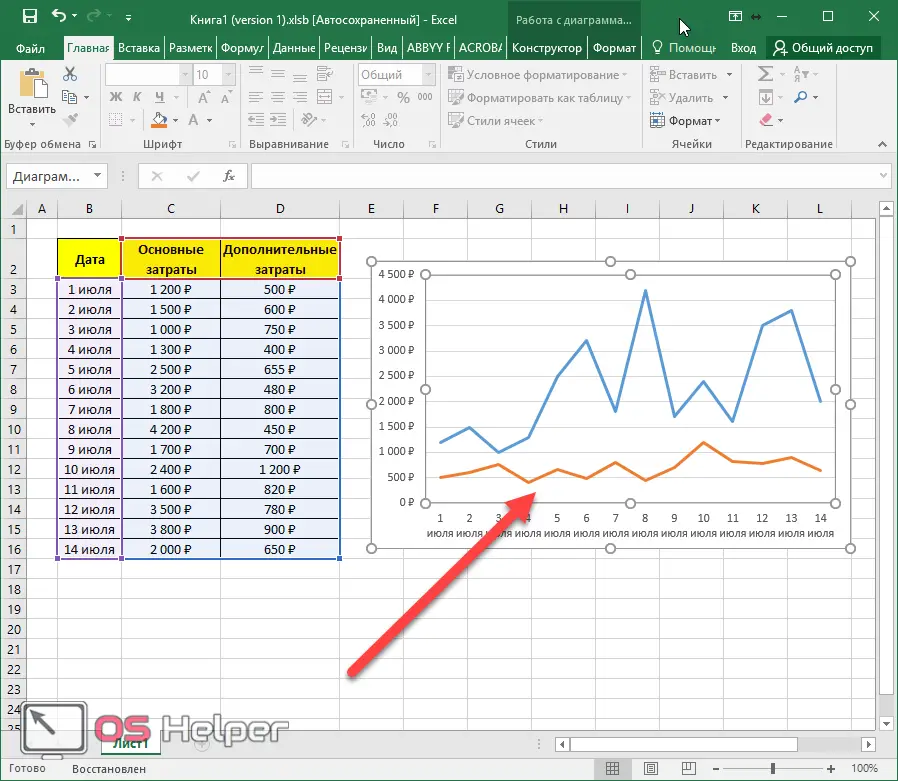
How to increase the number of values on a chart
The table usually stores information. But what if the chart has already been built, and more lines were added later? That is, there was more data, but this was not displayed in the diagram.
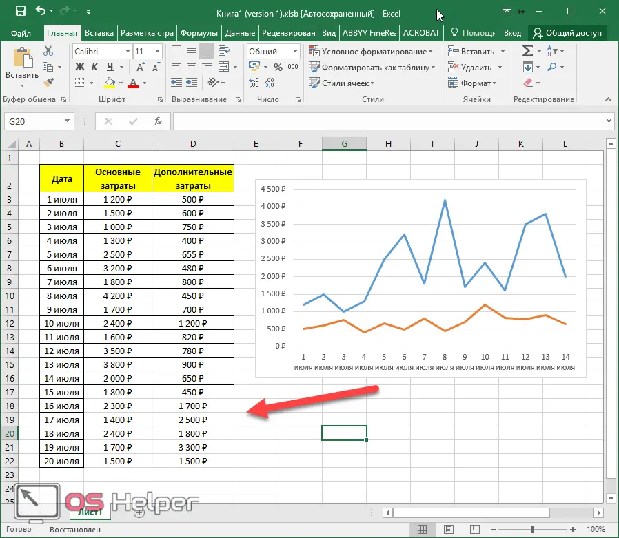
In this example, dates from July 15th to July 20th have been added, but they are not on the chart. In order to fix this, you need to do the following.
- Make a right mouse click on the diagram. In the context menu that appears, select "Select Data".
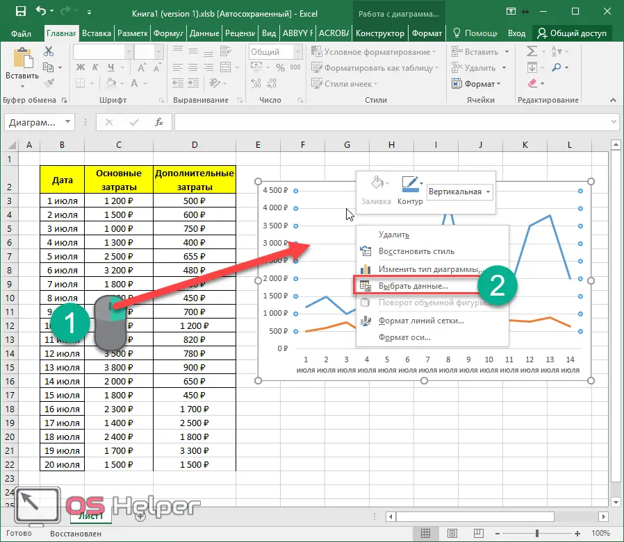
- Here we see that only part of the table is selected.
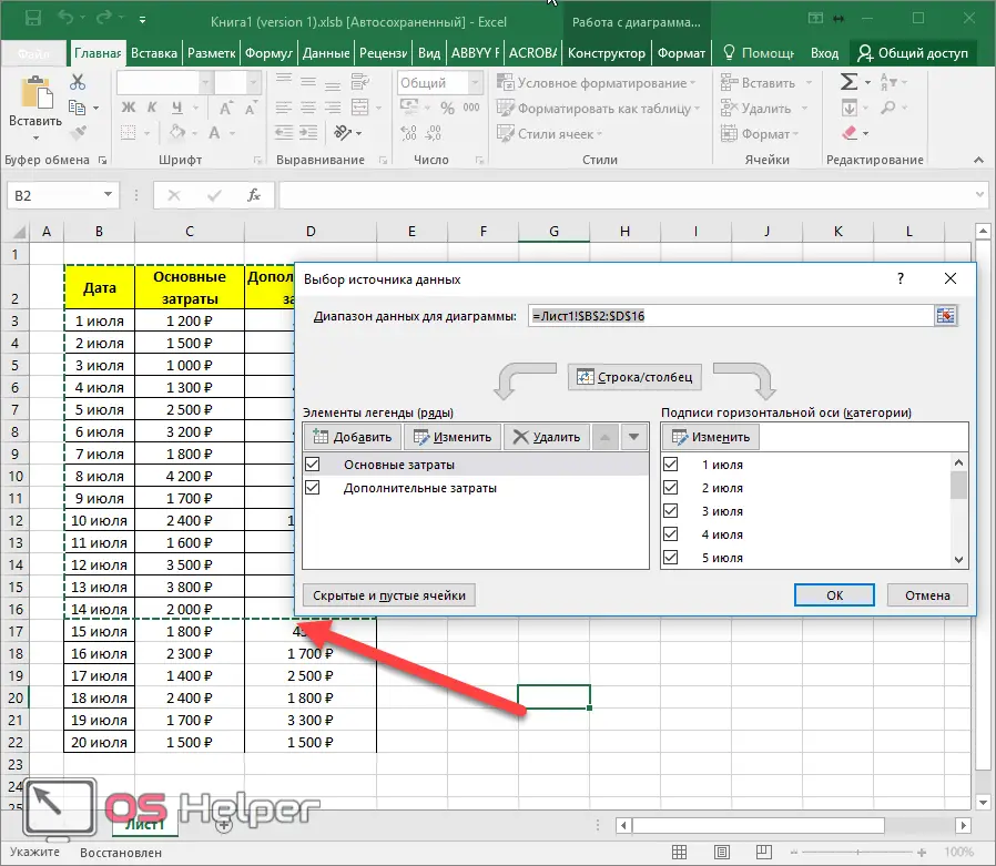
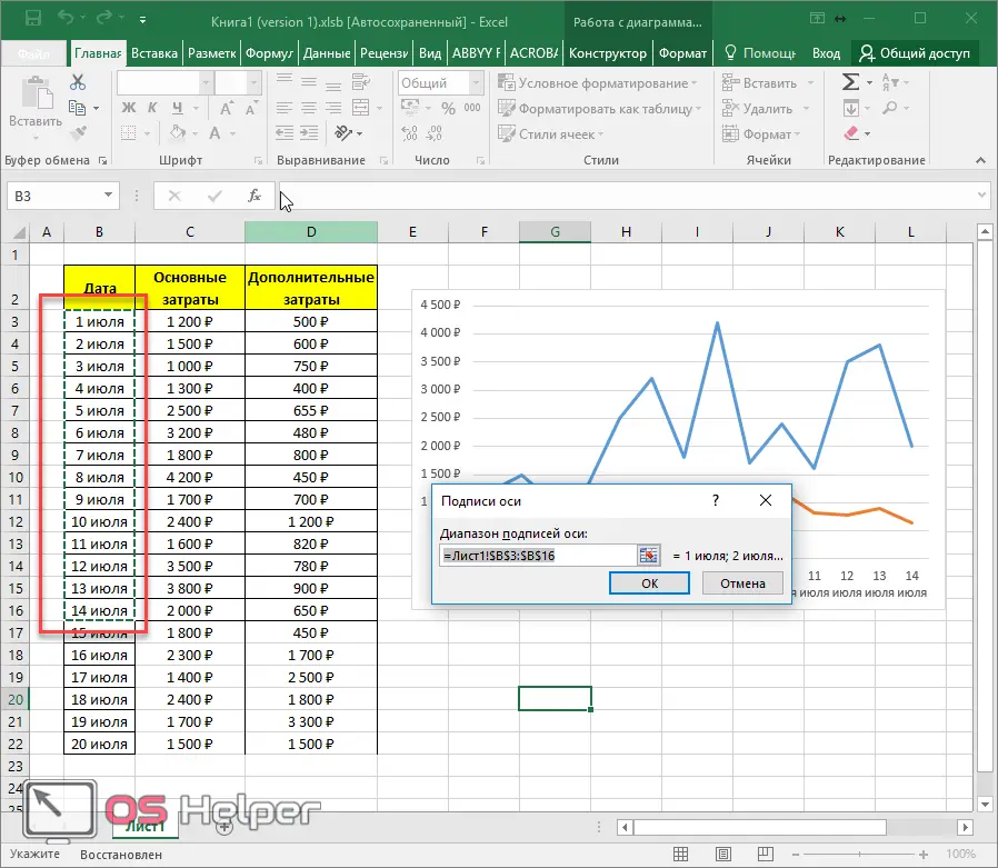
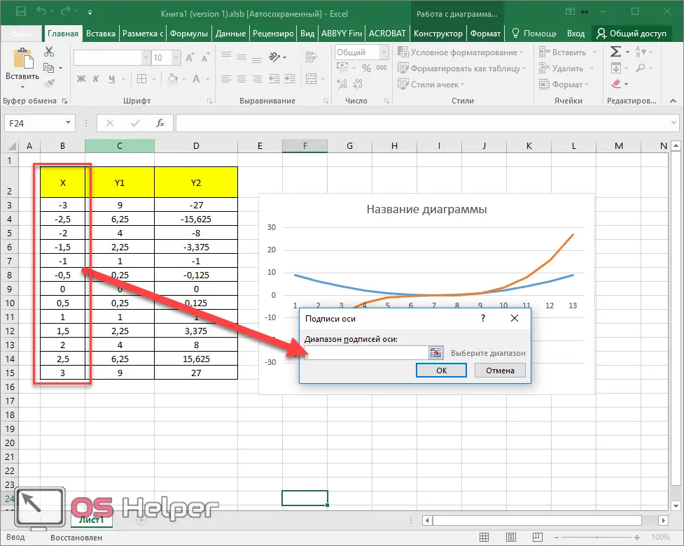
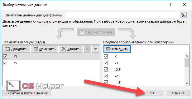
- Click on the "Edit" button for the label of the horizontal axis (category).
- You will be allocated dates through July 14th.
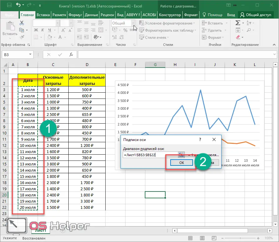
- Highlight them all the way and click on the "OK" button.
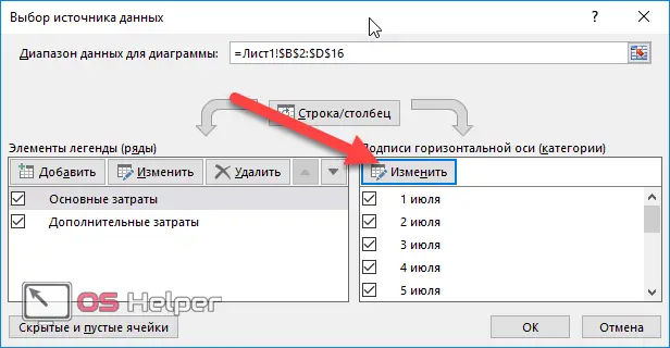
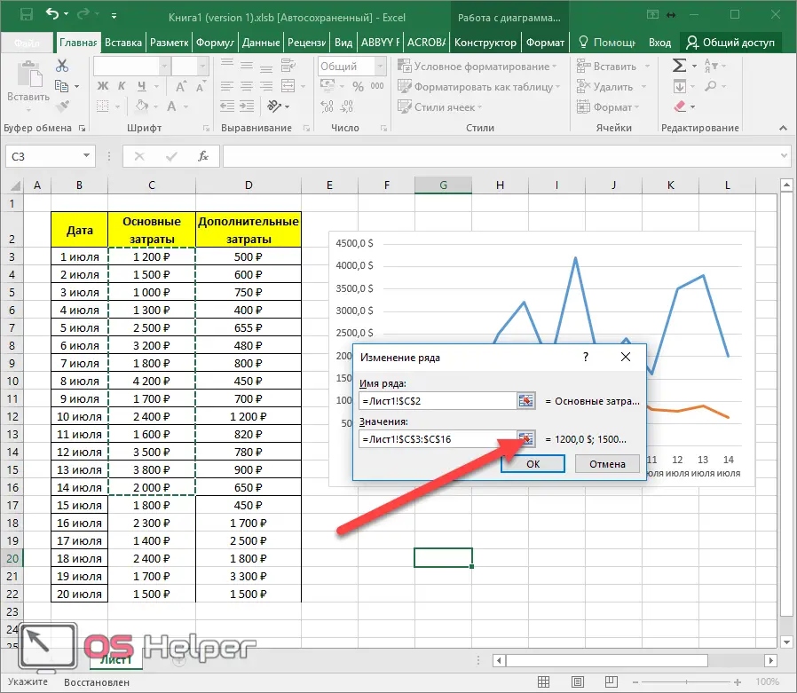
Now select one of the rows and click on the "Edit" button.
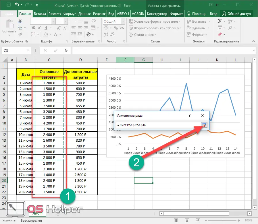
- Click the icon next to the "Values" field. Up to this point, you will have the column heading selected.
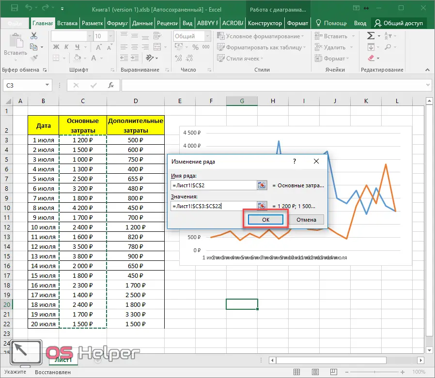
- After that, select all the values and click on this icon again.
- To save, click on the "OK" button.
- We do the same actions with the other side.
- Then we save all changes.
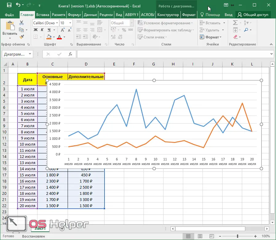
- As a result, our graph covers many more values.
- The horizontal axis has become unreadable because there are so many values. To fix this, you need to increase the width of the chart. To do this, move the cursor to the edge of the chart area and drag to the side.
- Thanks to this, the graph will become much more beautiful.
Plotting Mathematical Equations
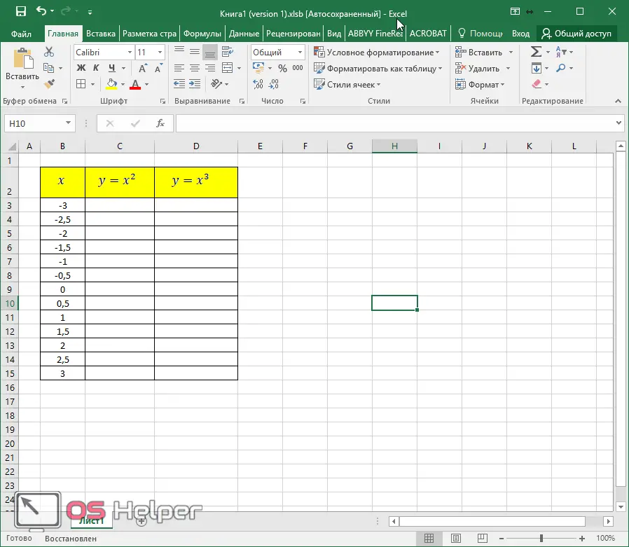
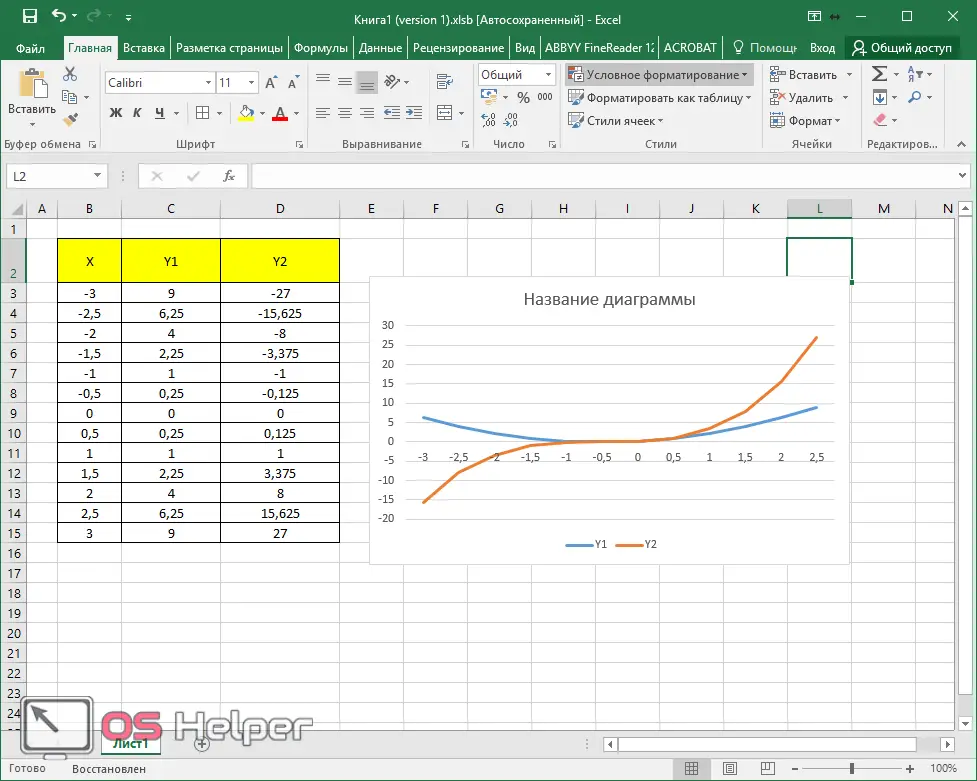
As a rule, educational institutions are sometimes given tasks in which they are asked to build a diagram based on the values of some function. For example, graphically represent formulas and their results depending on the value of the parameter x in the range of numbers from -3 to 3 with a step of 0.5. Let's see how to do it.
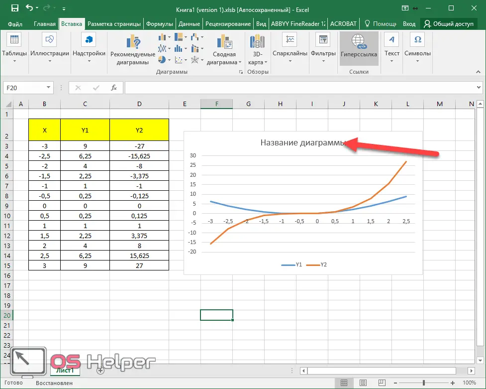
- First, let's create a table with x values in the specified interval.
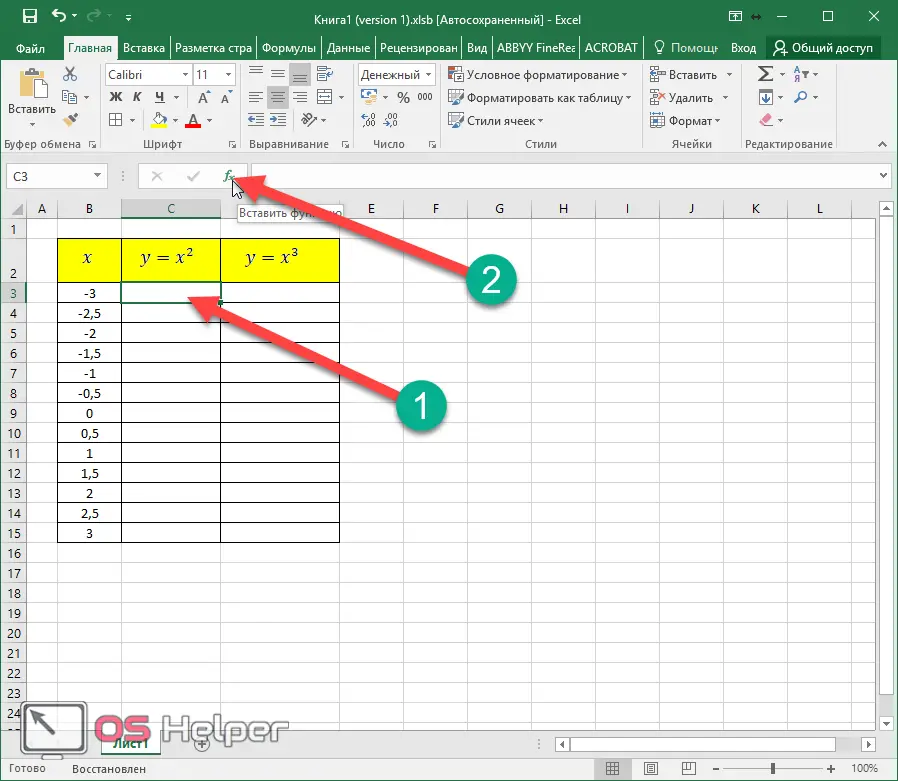
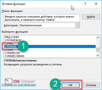
- Now let's insert the formula for the second column. To do this, first click in the first cell. Then click on the "Insert Function" icon.
- In the window that appears, select the "Math" category.
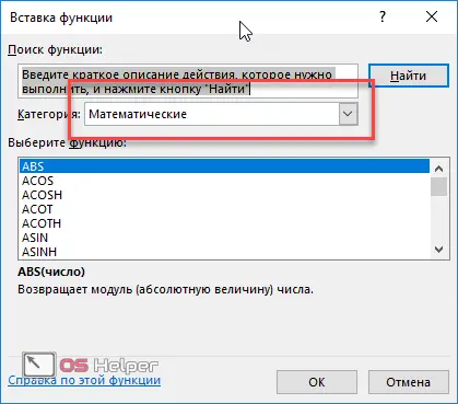
- Then find the "Degree" function in the list. It will be easy to find, as they are all sorted alphabetically.
The name and purpose of the formula may vary depending on the task. "Degree" is suitable for our example.
- After that, click on the "OK" button.
- Next, you will be asked to enter the original number. To do this, click on the first cell in the "X" column.
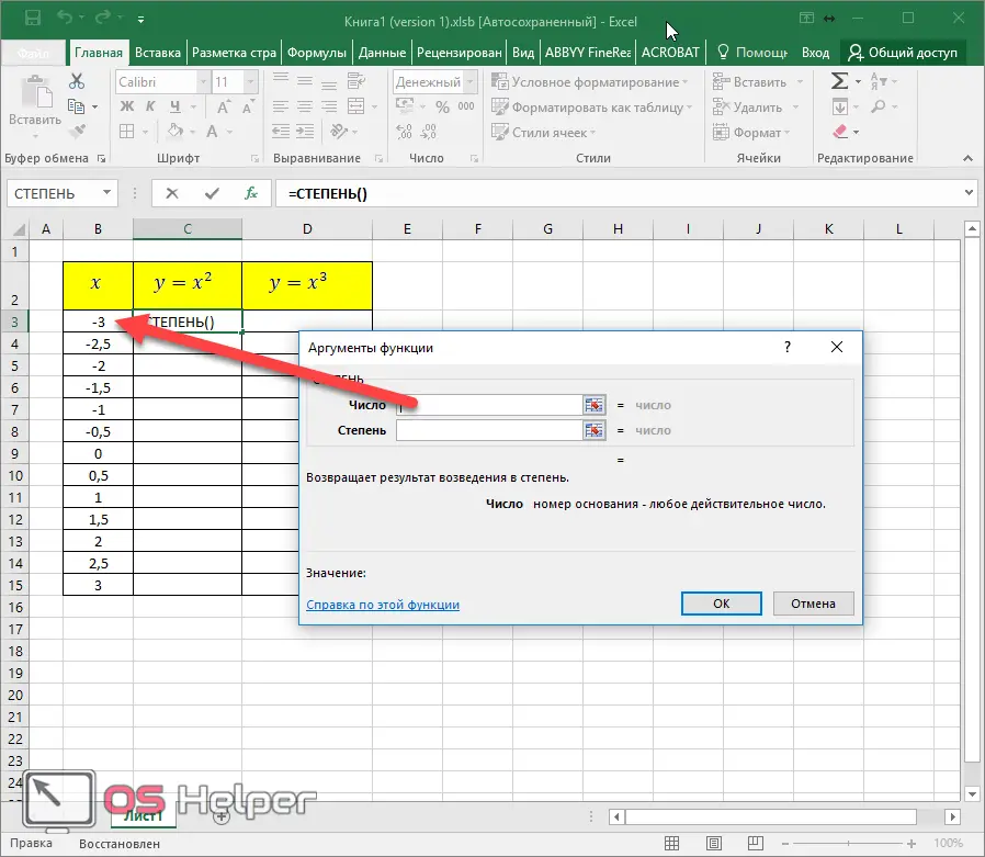
- In the "Degree" field, simply write the number "2". Click the OK button to paste.
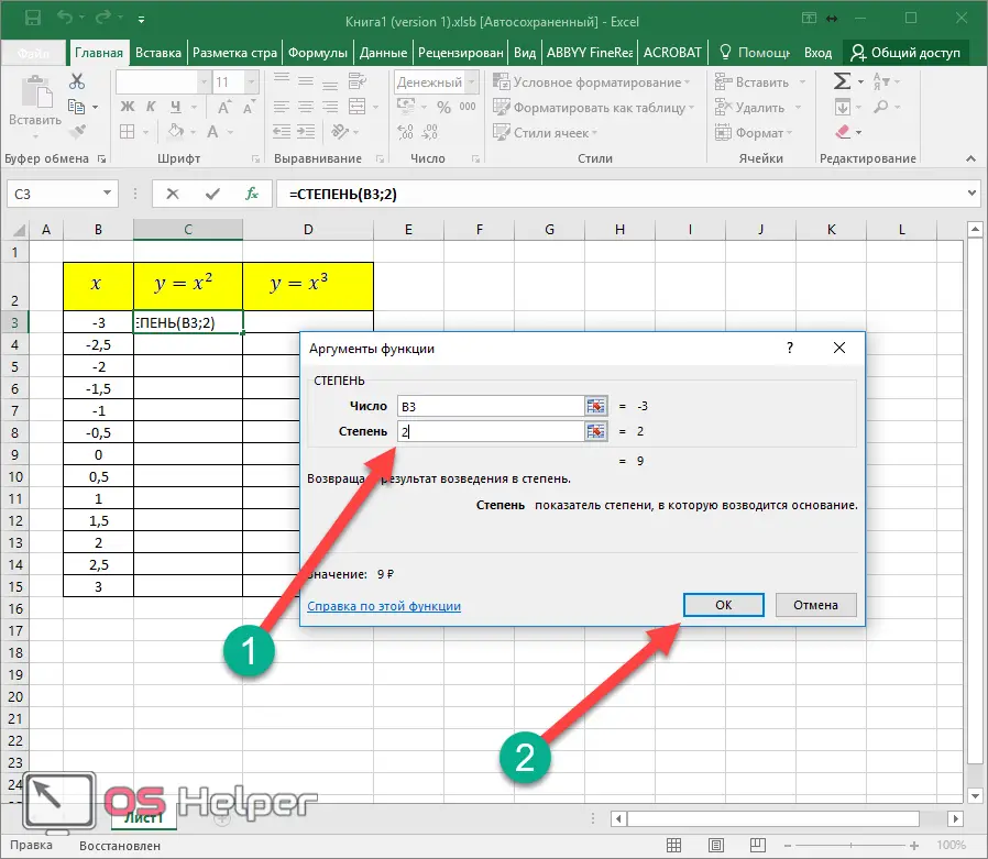
- Now hover over the bottom right corner of the cell and drag down to the very end.
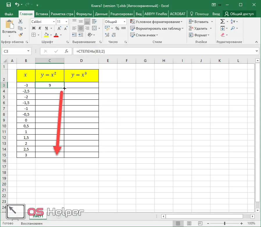
- You should get the following result.
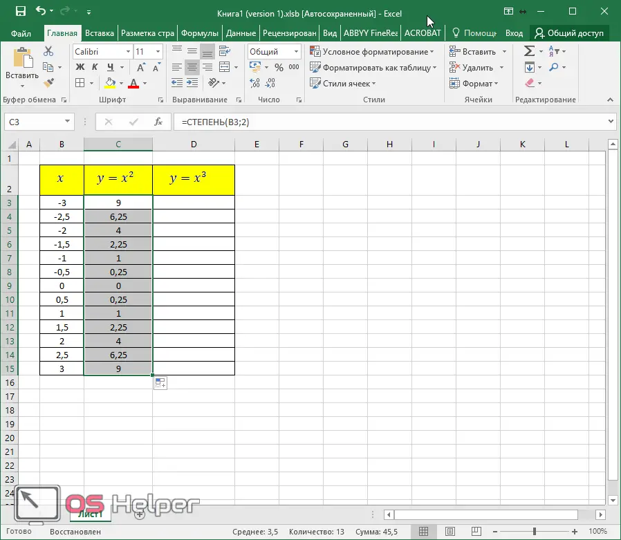
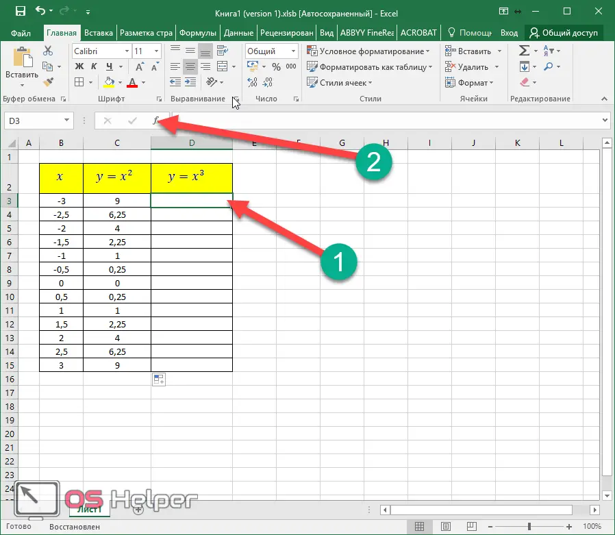
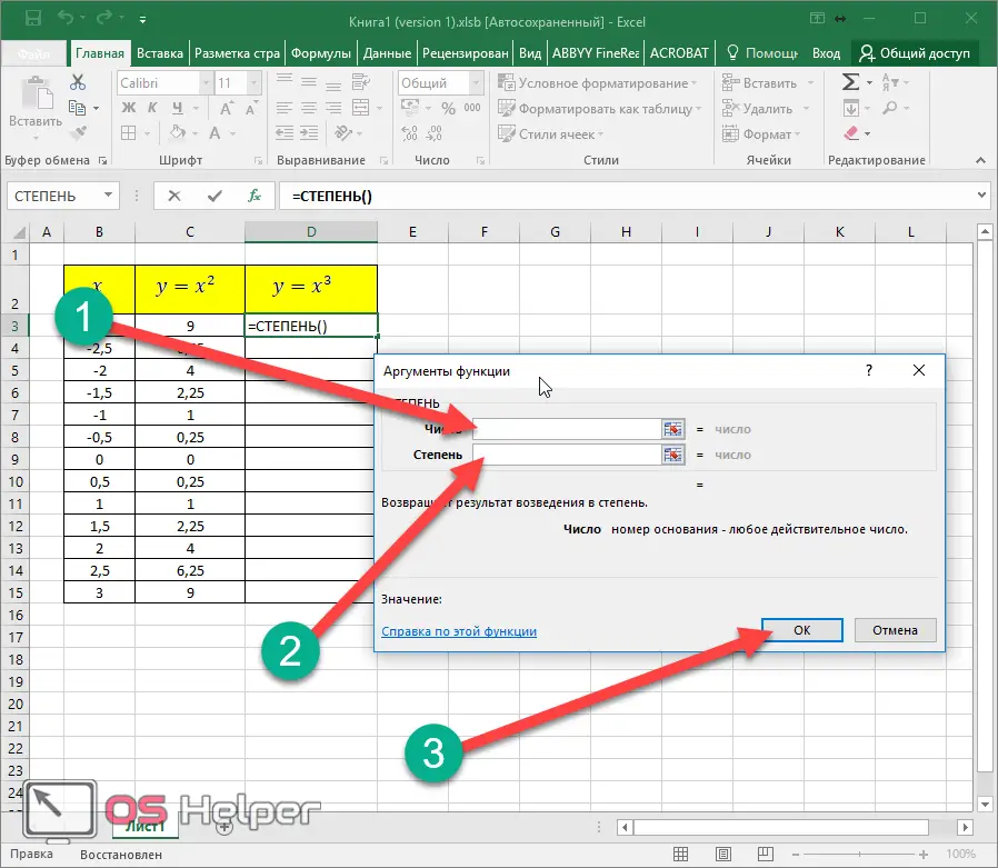
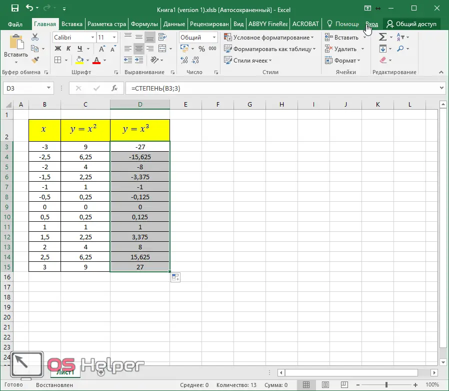
- Now insert the formula for the third column.
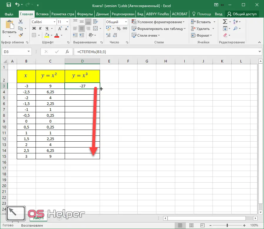
- Specify the first value of the cell "X" in the "Number" field. In the "Degree" section, enter the number "3" (according to the condition of the assignment). Click on the "OK" button.
- Duplicate the result to the very bottom.
Also Read: How to Create a Dropdown List in Excel
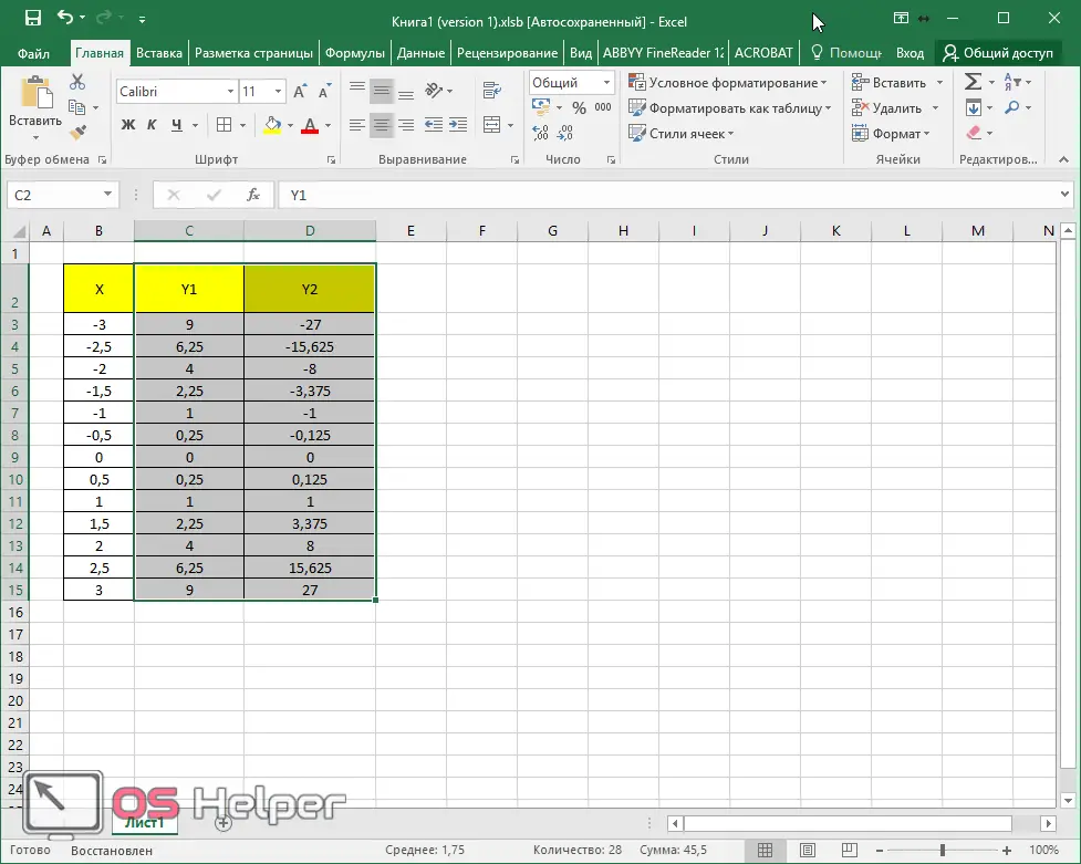
- This completes the table.
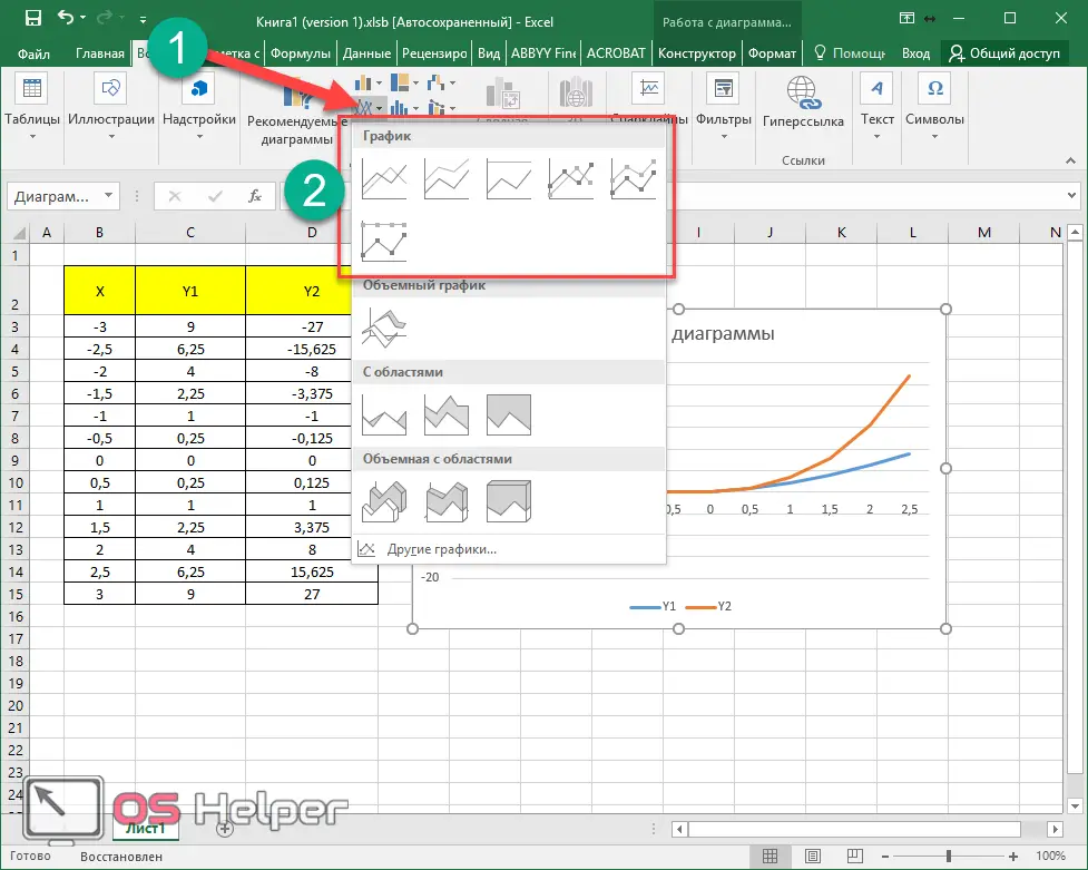
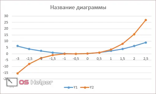
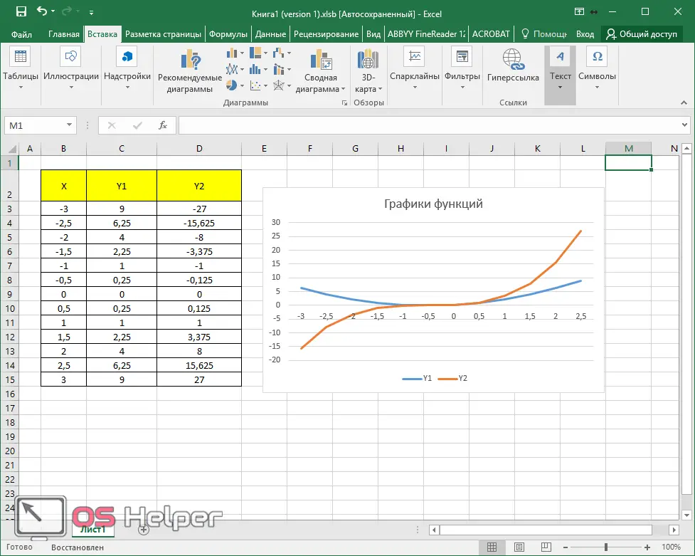
- Before inserting a graph, you need to select the two right columns.
Go to the "Insert" tab. Click on the "Graphics" icon. We choose the first of the proposed options.
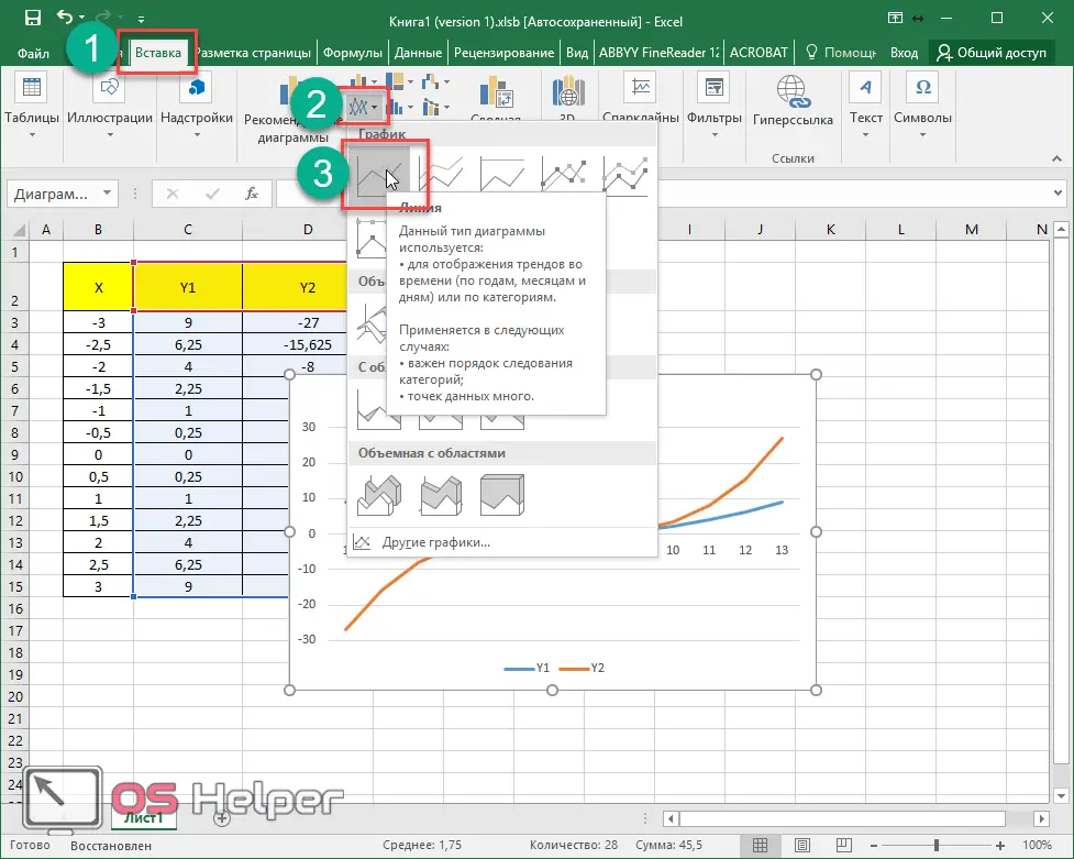
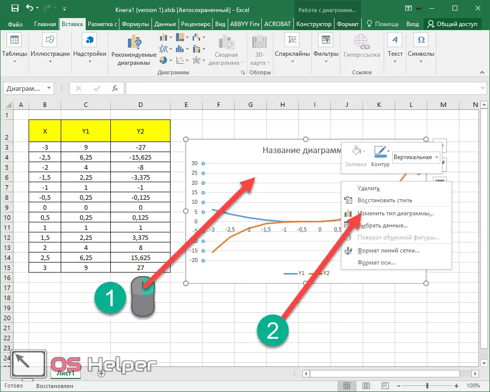
- Please note that in the table that appears, the horizontal axis has taken on arbitrary values.
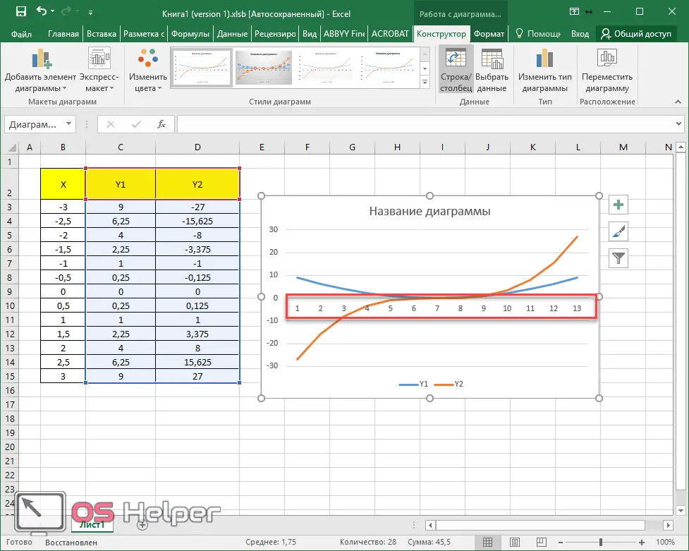
- In order to fix this, you need to right-click on the chart area. In the context menu that appears, select the "Select Data" item.
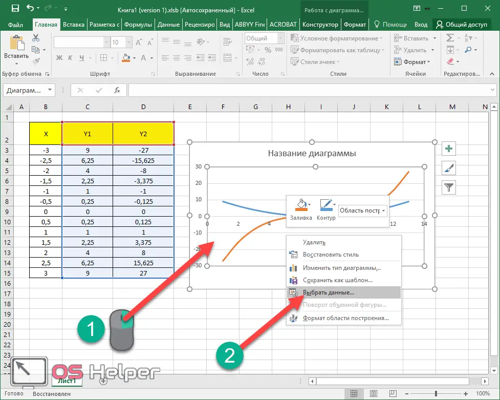
- Click on the "Change" button for the label of the horizontal axis.
- Select the entire first row.
- Then click on the "OK" button.
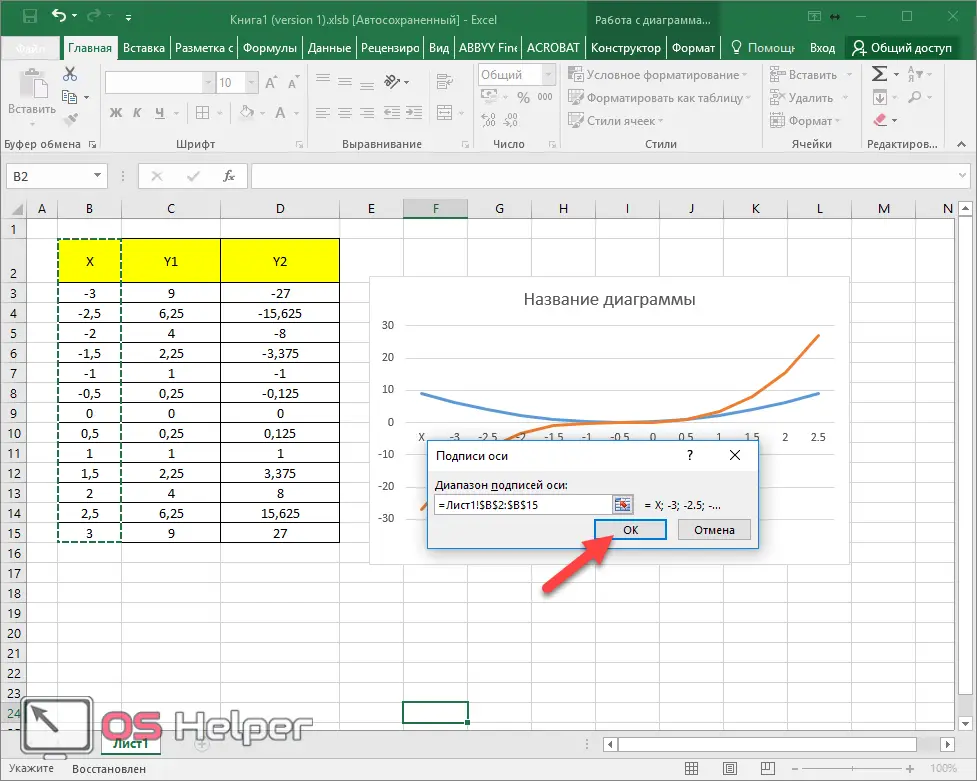
- To save the changes, click on "OK" again.
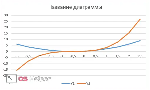
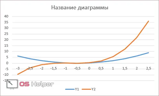
Now everything is as it should be.
If you immediately select three columns and build a graph on them, then on the diagram you will have three lines, not two. It is not right. The values of the X series do not need to be drawn.
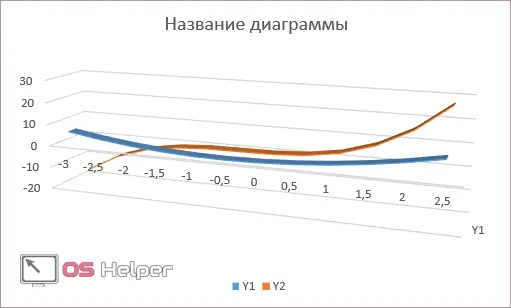
Graph types
To familiarize yourself with the different types of charts, you can do the following:
- view the preview on the toolbar;
- open the properties of an existing chart.
For the second case, you need to do the following steps:
- Make a right mouse click on an empty area. Select Change Chart Type from the context menu.
- After that, you can experiment with the look. To do this, just click on any of the proposed options. In addition, when hovering at the bottom, a large preview will be displayed.
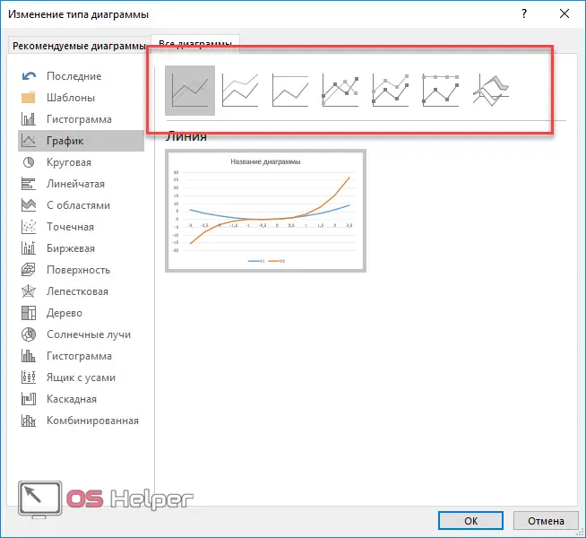
There are the following types of charts in Excel:
- normalized schedule with accumulation;
Decor
As a rule, not everyone is satisfied with the basic appearance of the created object. Someone wants more colors, another needs more information, and the third wants something completely different. Let's look at how you can change the design of charts.
Chart name
In order to change the title, you must first click on it.
Immediately after that, the inscription will be in the frame, and you can make changes.
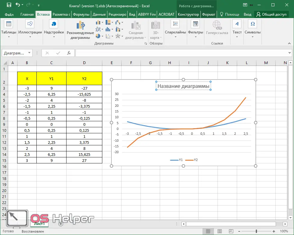
As a result, you can write anything.
In order to change the font, you need to right-click on the title and select the appropriate item from the context menu.
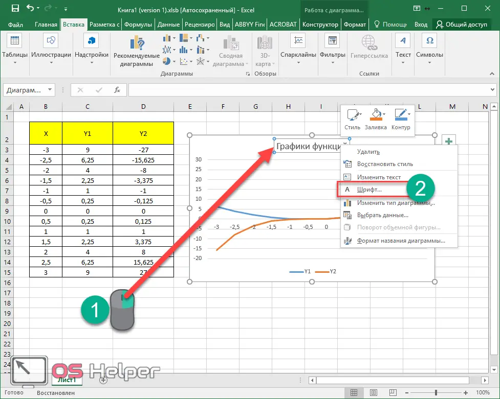
Immediately after that, you will see a window in which you can do the same with the text as in the Microsoft Word editor.
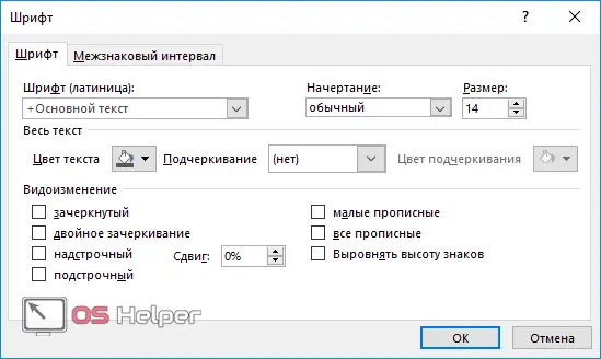
To save, click on the "OK" button.
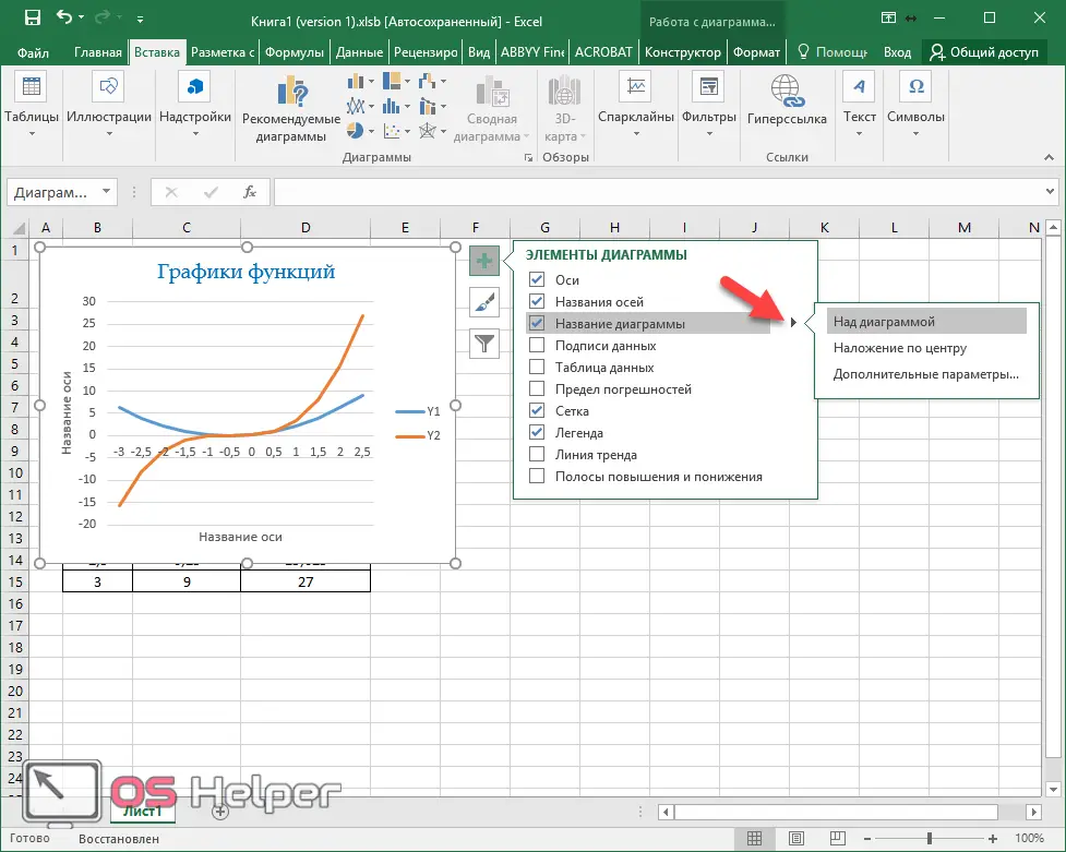
Please note that there is an additional "submenu" opposite this element, in which you can choose the position of the name:
- above;
- center overlay;
- Extra options.
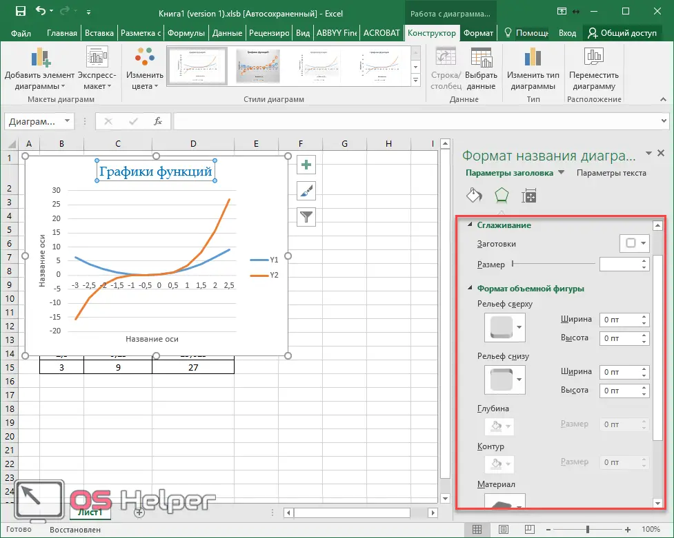
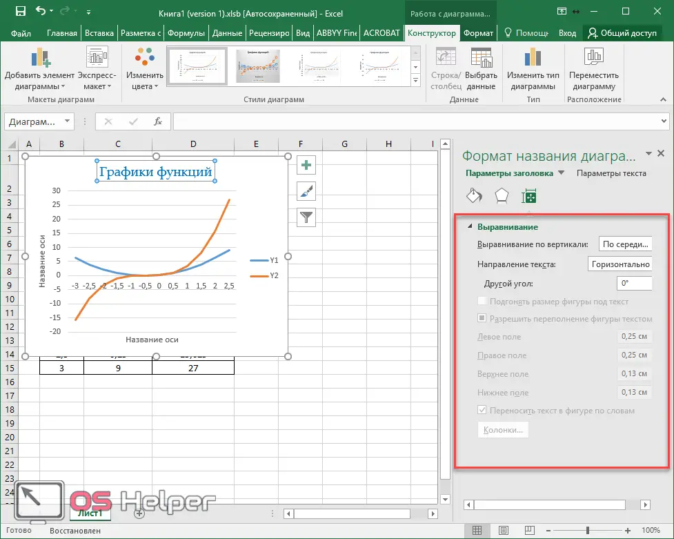
If you select the last item, then you will have an additional sidebar in which you can:

- select the type of border;
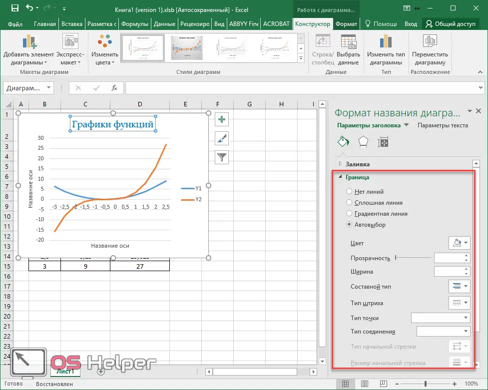
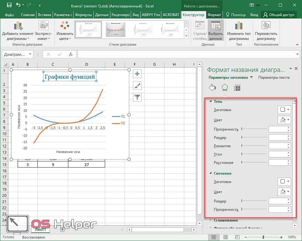
- anti-aliasing and format of a three-dimensional figure;
Axes name
In order for the vertical and horizontal axes not to remain nameless, you need to do the following.
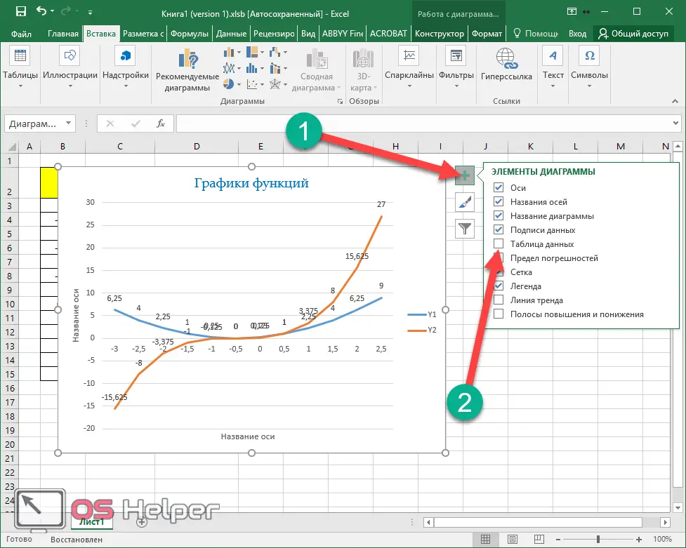
- Click on the "+" icon to the right of the chart. Then, in the menu that appears, check the box next to "Axis Names".
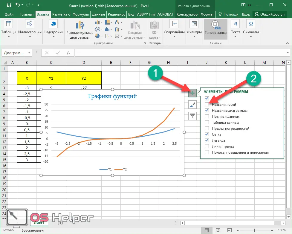
- Thanks to this, you will see the following result.
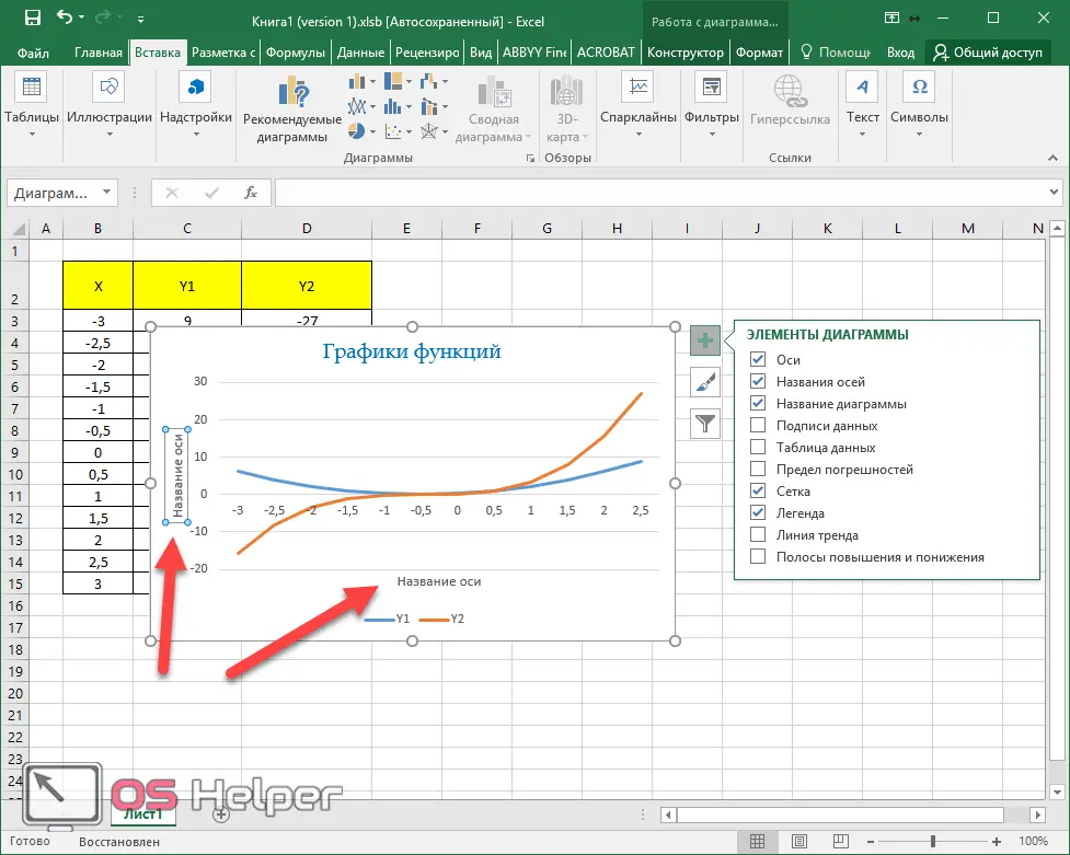
- Editing the text is exactly the same as with the title. That is, it is enough to click on it for the corresponding opportunity to appear.
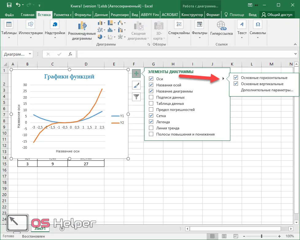
Please note that to the right of the "Axis" element there is a "triangle" icon. When you click on it, an additional menu will appear in which you can specify what kind of information you need.
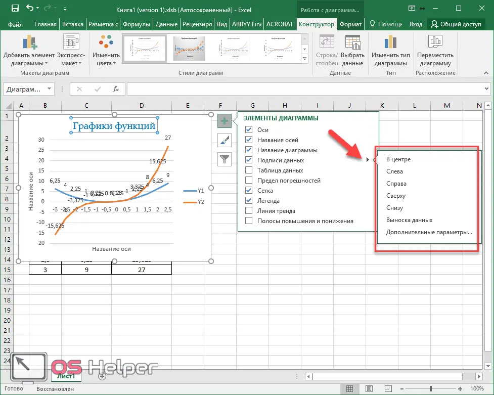
Data Signatures
To activate this function, you must again click on the “+” icon and check the corresponding box.
Also Read: How to Freeze a Row in Excel
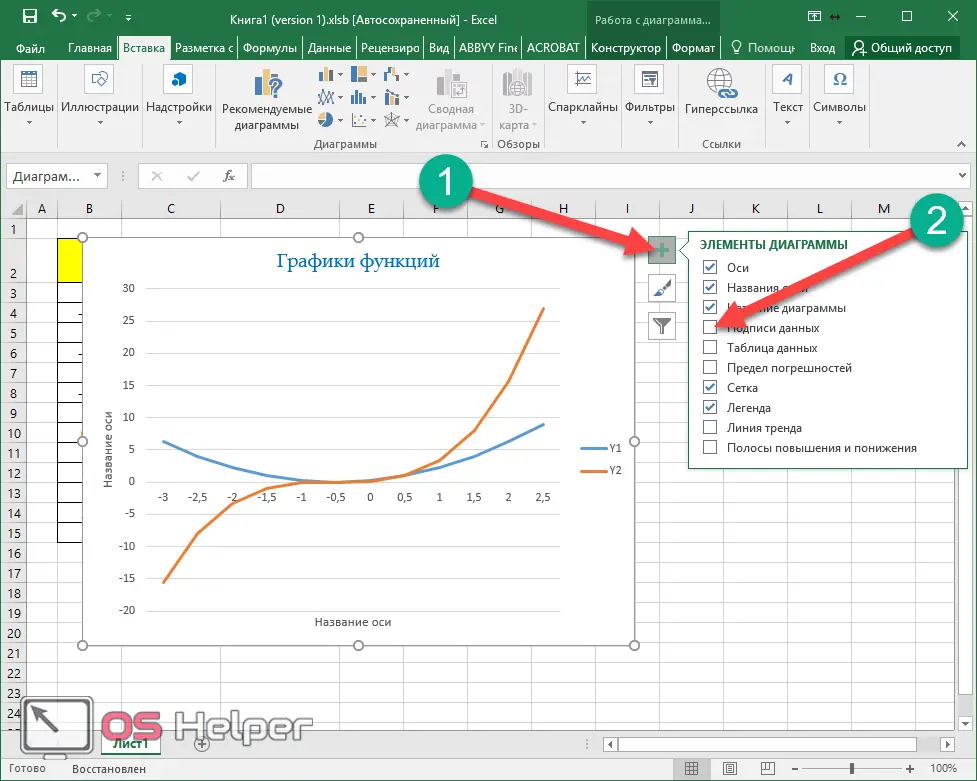
As a result, a number will appear next to each value, according to which the graph was built. In some cases, this makes the analysis easier.
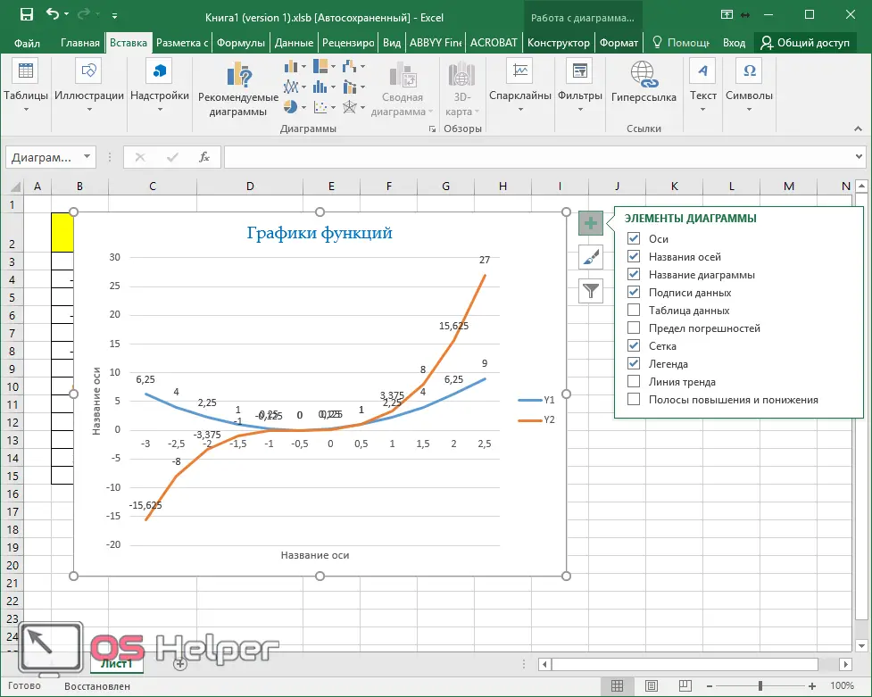
If you click on the “triangle” icon, an additional menu will appear in which you can specify the position of these numbers:
- in the center;
- left;
- on right;
- above;
- bottom;
- data callout.
When you click on the "Advanced Options" item, a panel with various properties will appear on the right side of the program. There you can:
- include in captions:
- value from cells;
- row name;
- category name;
- meaning;
- callout lines;
- legend key;
- add a separator between text;
- indicate the position of the signature;
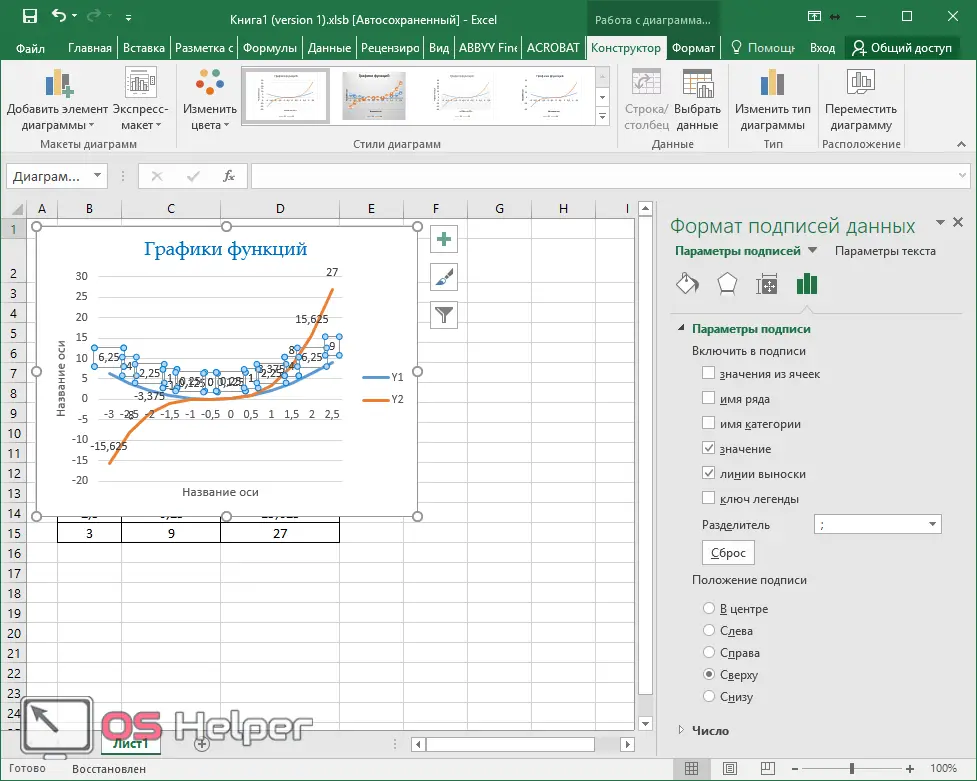
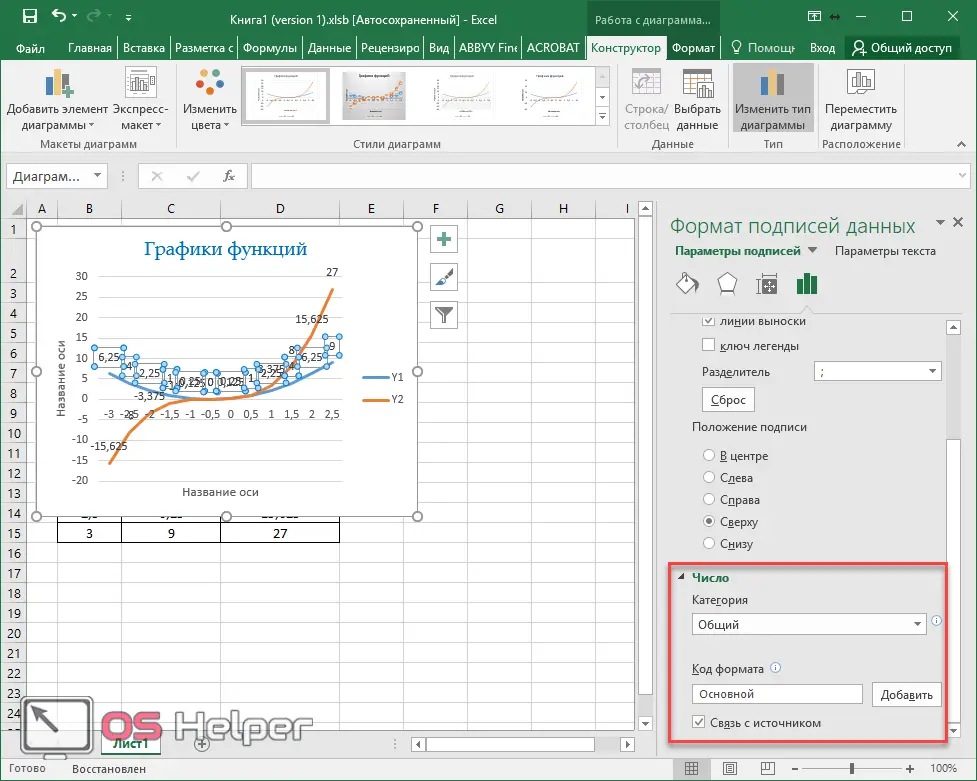
- specify the number format.
The main categories are:
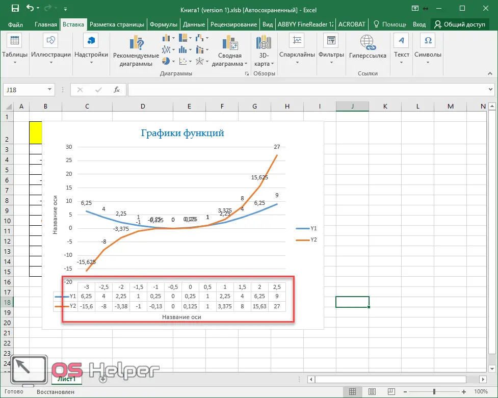
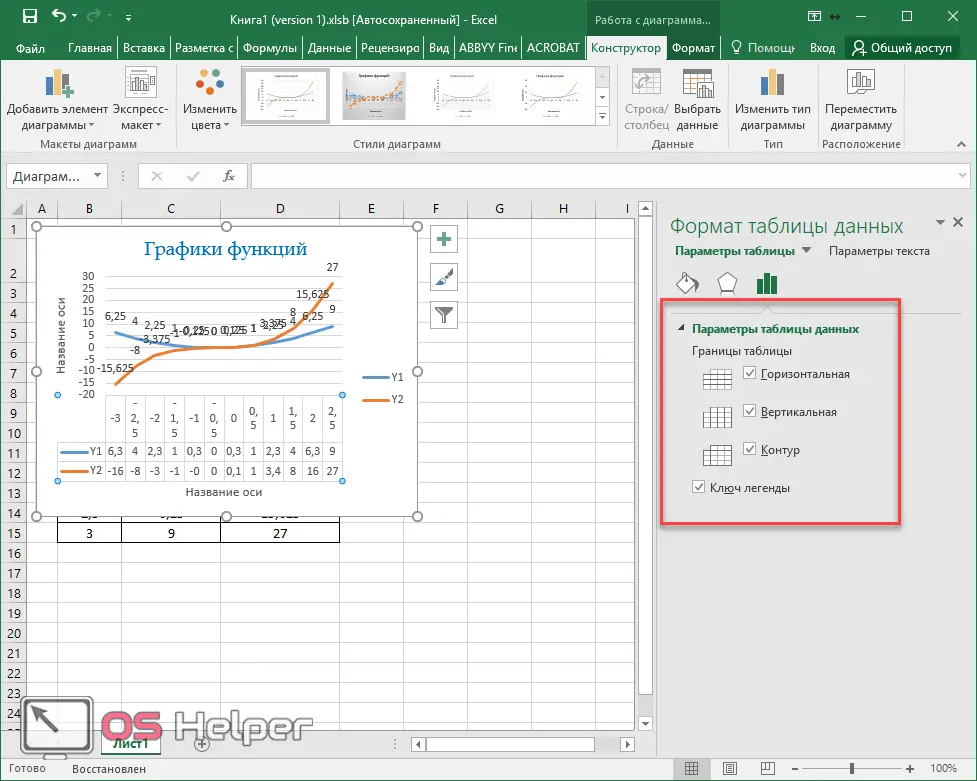
data table
This chart component is enabled in a similar way.
This will give the chart a table of all the values that were used to create the chart.
This function also has its own additional menu, in which you can specify whether or not to show the keys of the legend.
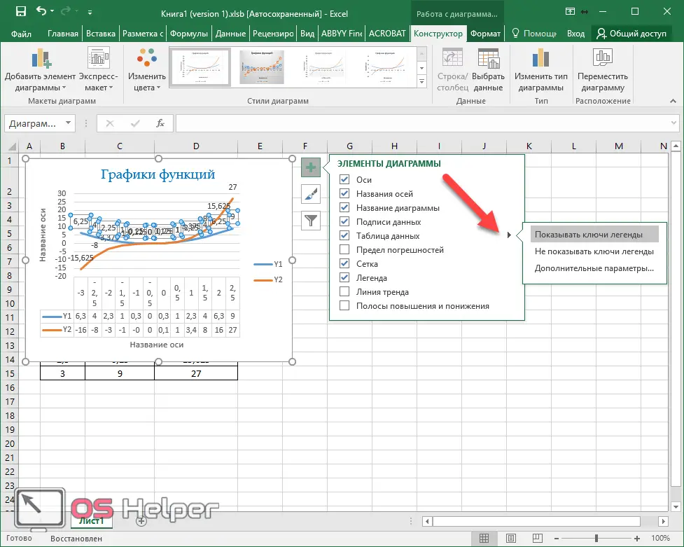
When you click on the "Advanced Options" item, you will see the following.
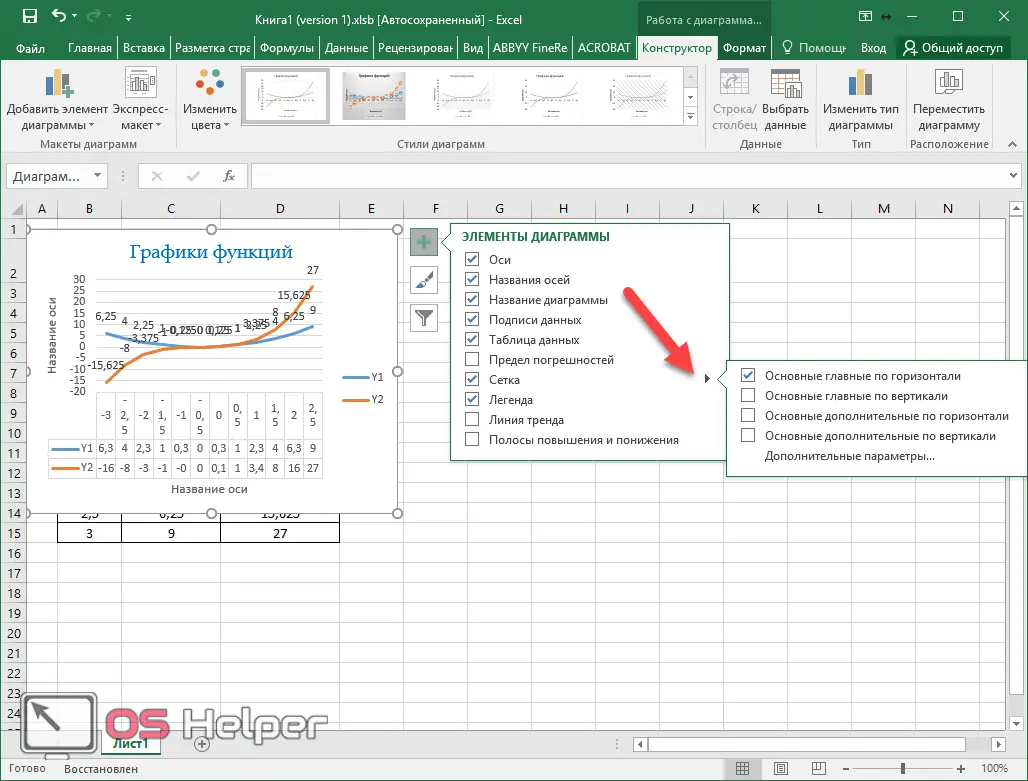
Grid
This chart component is displayed by default. But in the settings, in addition to horizontal lines, you can enable:
- vertical lines;
- additional lines in both directions (drawing step will be significantly reduced).
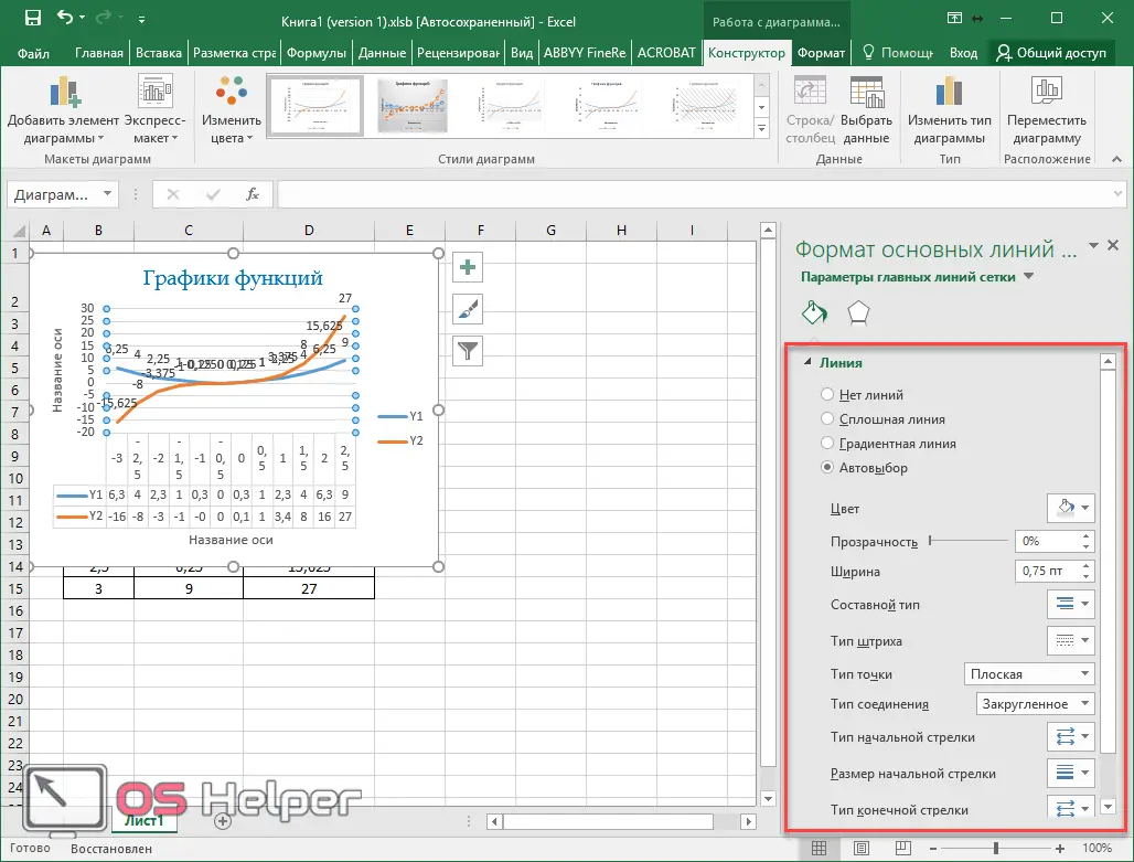
In the advanced options, you can see the following.
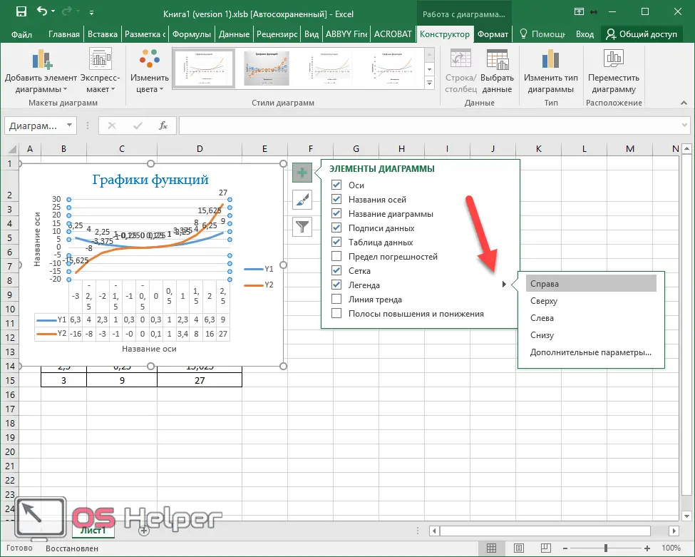
Legend
This element is always enabled by default. If you wish, you can turn it off or specify a position on the chart.
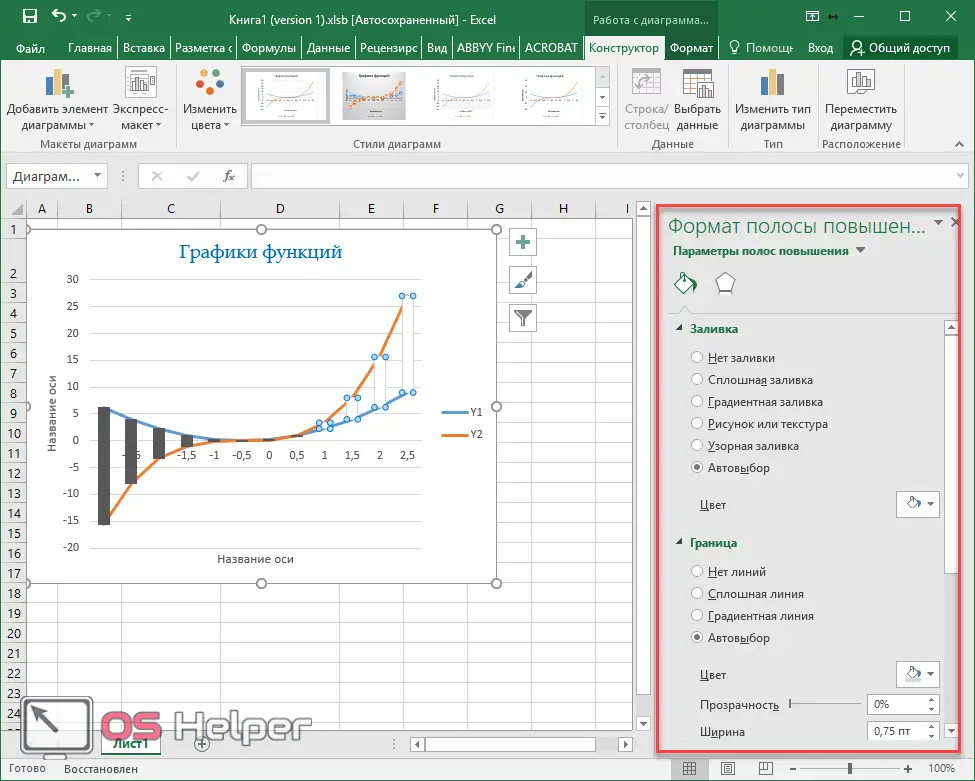
Down and up bands
If you enable this chart property, you will see the following changes.
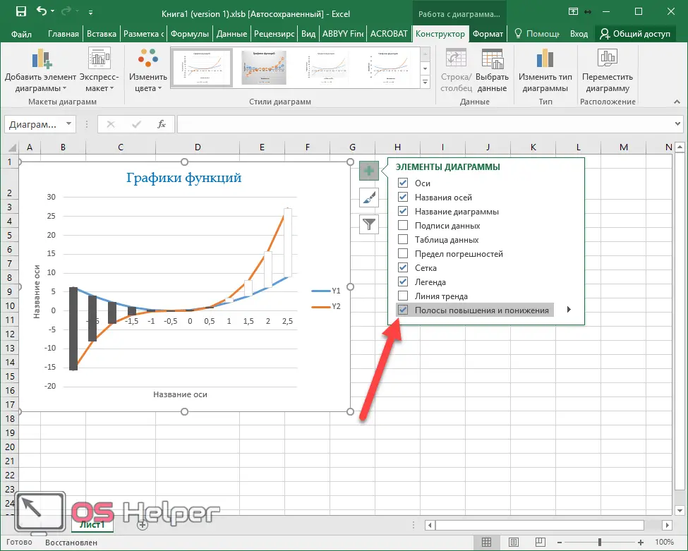
Additional parameters of the "Stripes" include:
Additional tabs on the toolbar
Please note that each time you start working with the chart, additional tabs appear at the top. Let's consider them more carefully.
Constructor
In this section you will be able to:
- add element;
- choose an express layout;
- change color;
- specify the style (when hovering, the chart will change its appearance for preview);
- select data;
- change type;
- move the object.
Format
The content of this section is constantly changing. It all depends on what object (element) you are working with at the moment.
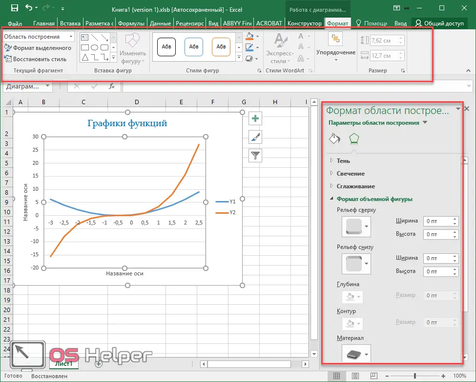
Using this tab, you can do anything with the appearance of the chart.
Conclusion
In this article, the construction of various types of graphs for different purposes was considered step by step. If something doesn't work for you, you may be highlighting the wrong data in the table.
In addition, the lack of the expected result may be due to the wrong choice of chart type. A large number of appearance options are associated with various purposes.
Video instruction
If you are still unable to build something normal, it is recommended that you watch the video, which provides additional comments on the above instructions.